

FREE PUBLIC WEBINAR: WATCH REPORT HIGHLIGHTS & Q/A - Thursday October 12th 12PM ET

Join John Pasalis, report author, market analyst and President of Realosophy Realty, in a free monthly webinar as he discusses key highlights from this report, with added timely observations about new emerging issues, and answers your questions. A must see for well-informed Toronto area real estate consumers.
Toronto’s housing market continued to cool as we moved from the summer into the fall home-buying season, normally the second busiest time for the market each year.
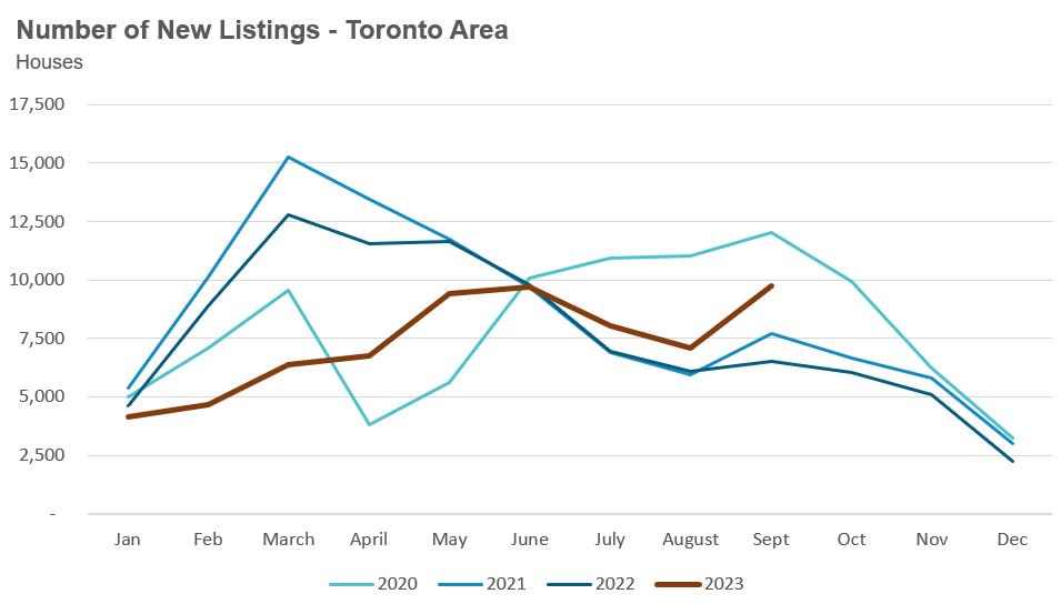
The fall home buying season has seen climbing housing inventory continue its upward trend that began over the summer.
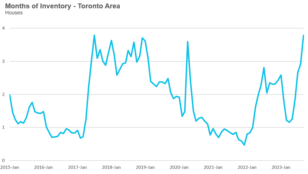
As new listings increase and sales decline, the Months of Inventory (MOI) for houses has increased from 1.3 in May to 3.8 in the past month of September.
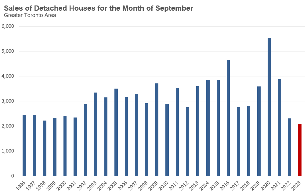
New listings during the first half of the year were at 20-year lows for most of the period but have started to increase closer to historical monthly levels over the past few months. On the other hand, sales have plummeted, with detached home sales for September at their lowest level on record.
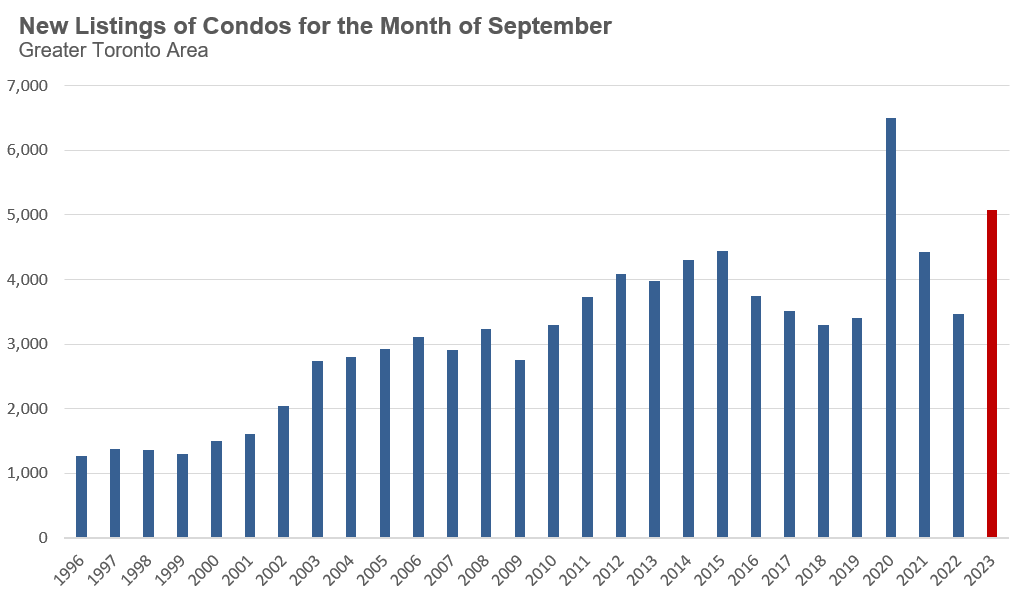
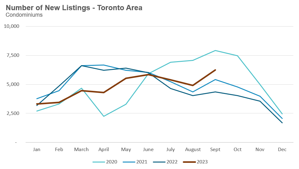
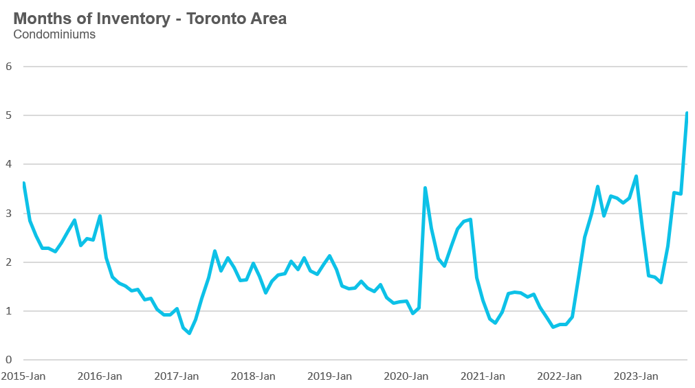
The dynamics in the condo market, however, are slightly different. Condo sales are below the long-term average for September but are not at record-low levels as we see in the detached home market. On the other hand, new listings have climbed to a new high for September, behind only the 2020 record high during the Covid-19 global pandemic.
These dynamics have pushed the MOI for condos from 1.6 in May to 5.1 MOI in September.
If new listings continue to outpace sales, then the inventory of homes available for sale will increase, which could put downward pressure on prices.
But if the number of new listings coming on the market begins to trend lower in the months ahead, this may lead to a levelling off in prices, much like what we saw last year.
This will be a key trend to watch.
By the Numbers: September 2023
Year-over-year, the average price for a house in the Toronto area was $1,366,876 in September, up 6% over the same month last year. Last month's median house price was $1,181,000, up 4% over last year.
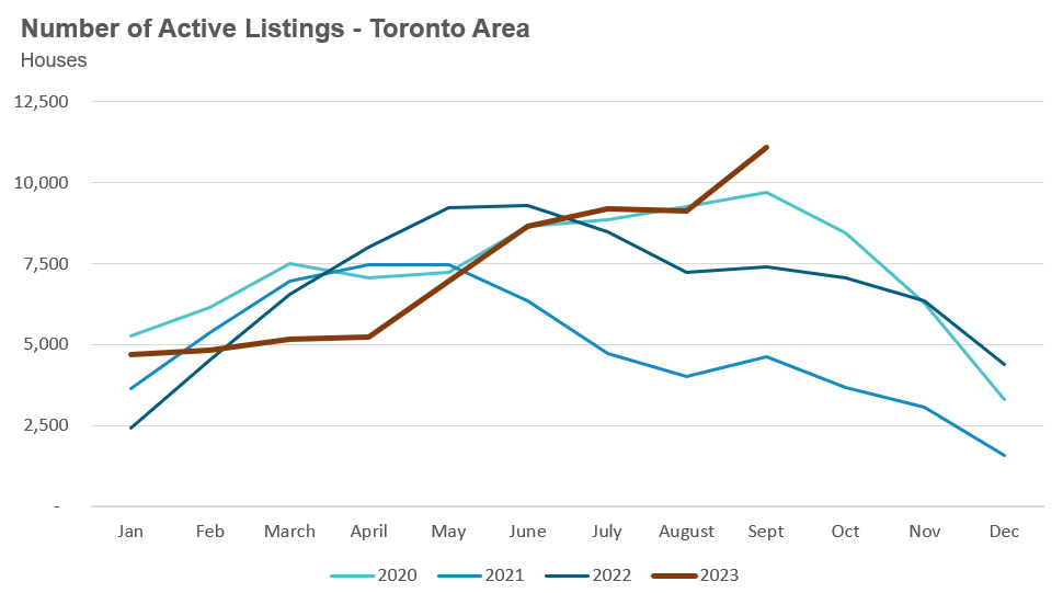
House sales in September were down 7% over last year, while new house listings were up 49%. The number of houses available for sale at the end of the month, or active listings, was up 50% over last year.
The current balance between supply and demand is reflected in the Months of Inventory (MOI), which is a measure of inventory relative to the number of sales each month (for a more detailed explanation of this measure, see the final section of this report). In September, the MOI for houses increased to 3.8, a sharp increase from 1.3 in May just four months ago, indicating a slowing market.
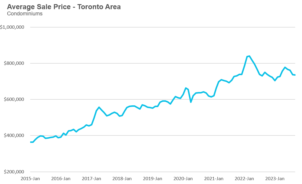
The average price for a condominium (condo) in the Toronto Area was $735,366 in September, which is down 2% over last year. The median price for a condo in September was $670,000, down 1% over last year.
Condo sales in September were down 4% over last year, and new condo listings were up 43% over last year. The number of active condo listings was up 44% over last year. The MOI increased to 5.05. Much like the market for houses, this is a rapid increase from 1.6 in May, indicating a slowing market.
For detailed monthly statistics for September 2023, the entire Toronto area market, including house, condo and regional breakdowns, see the final section of this report.
Over the past month, I have received a relatively high number of calls from investors who are looking to reduce their debt load by selling one or more properties. In all cases, the investors owned multiple properties (usually three or more) rather than a single property and are exploring different options, including either selling one or two, or continuing to rent them out.
I decided to look at the data to see if investors are selling their homes at a higher rate and, if they are, how this has changed over time.
First a quick note on methodology. We can estimate if a condo that sold on the MLS is owned by an investor by checking to see if the last transaction on that property on the MLS system was a sale or a rental. If the last transaction was a rental, we can be confident that the seller is an investor who is either selling the condo tenanted (i.e., with a renter in place) or vacant. If the last transaction was a sale, we can reasonably assume that the unit was owner-occupied.
Now, it should be noted that this is not a perfect estimate for investor activity given that some cases will be missed. For example, if an investor rents their condo unit out privately, they would be classified as an end-user (i.e., someone who bought the unit to live in it themselves) when they sell because we wouldn’t have any record of a previous rental transaction for that unit. That being said, the share of investors renting their properties out privately should not change much over time so this should not impede our ability to see the trends under investigation.
Accordingly, the chart below shows the percentage of condos sold each month in the City of Toronto that we believe are owned by investors. The data is estimated monthly, but the chart shows a three-month rolling average to reduce some of the volatility in the data. I limited the results to condos in the City of Toronto since this is where investor ownership is the most concentrated in the Greater Toronto Area (GTA).
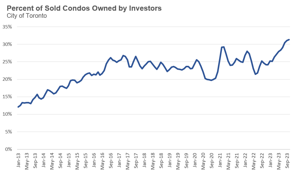
While the share of investor-owned sales is on the rise, we are not seeing a significant sell-off yet.
Having said this, it should be noted that we don’t need to see a widespread sell-off for this to impact both the resale and rental markets.
When sales are relatively low, even a modest increase in condos listed for sale can shift the balance of the market from a balanced market to a buyer’s market, putting downward pressure on prices.
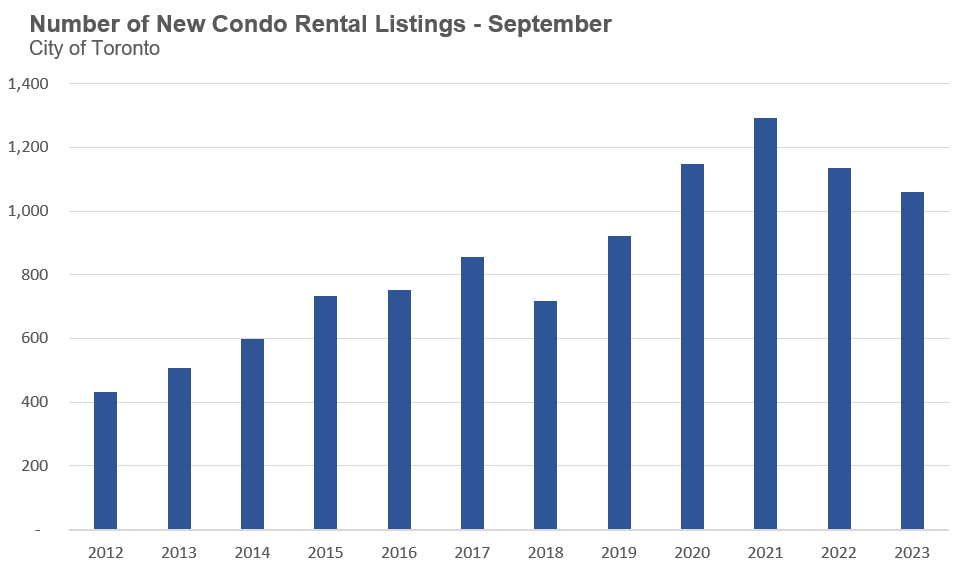
On the flip side, as more investors decide to sell units rather than rent them out, this will reduce the stock of rental units, which will put upward pressure on rent prices. The chart below shows the number of new condo rental listings for September, which shows signs of trending lower.
I will be monitoring how changes in investor selling behaviour may impact the resale market and rental market in the months ahead.
While the inventory of homes available for sale in Toronto this year is far higher than last year (as discussed above in this report), I was surprised to see that homes sold faster this year than last.
The chart below shows the cumulative days on market for houses and condos for the month of September 2022 and 2023. By cumulative days on market, I mean the total days on market DOM), which includes the DOM for the sold listing and the sum of the DOM for any previously cancelled listing for the same home, going back to May 2023. I do this because many sellers will remove their property from the market and re-list it so that all periods of DOM, not just the most recent one, must be counted to get the total picture of how long a home has been for sale on the market.
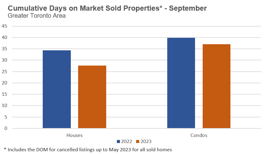
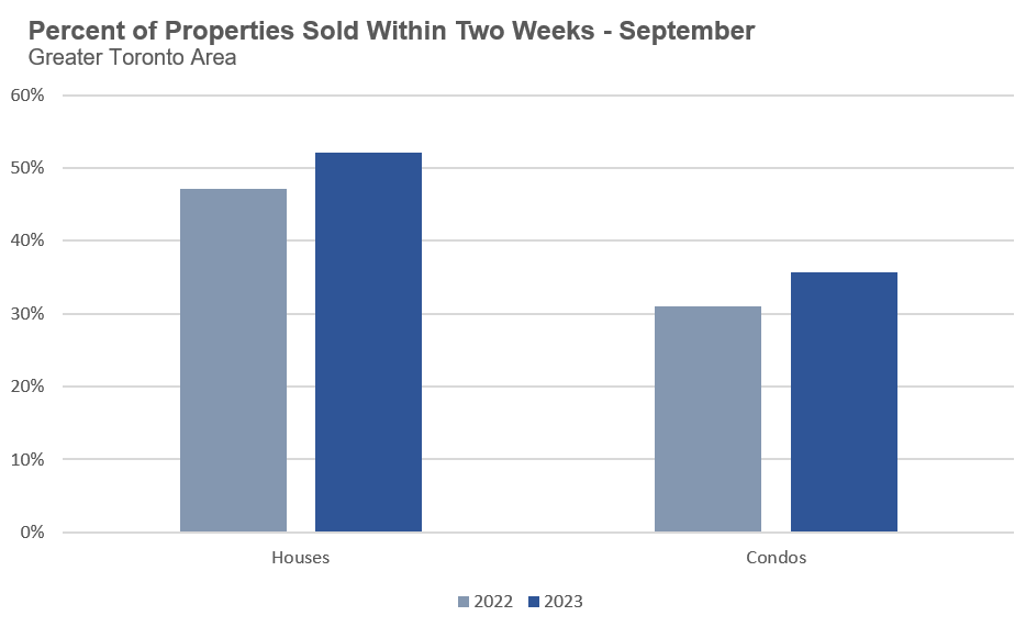
The next chart below shows the percentage of homes that sold in the first two weeks, which again is based on the cumulative DOM for each home. From it, we can see that 52% of houses sold in the first two weeks last month compared to just 47% a year earlier. Turning to the condo market, 36% sold within the first two weeks this year compared to 31% last year.
This is surprising because normally when there are more homes on the market, buyers have more selection and are less pressured to compete for homes for sale, normally increasing the time it takes for a home to sell.
So why are homes selling faster this year even though inventory levels are higher?
I suspect that one of the main factors is that today’s home sellers have responded to today’s market dynamics and the slight decline in prices since May of this year (approximately 10%), far faster than last year’s sellers. Last year’s sellers were facing a much sharper decline in prices from the high reached in February 2022 (approximately 20%), so they were likely a bit more stubborn and reluctant to reduce their prices by that larger amount.
For now, it appears that homes priced well and at today’s levels are selling relatively quickly, even given the surge in inventory.
“We are facing a shortage of housing right now, and that’s why prices of homes have become far too high. It’s not fair to young people, who feel that cities are turning their backs on them. When housing is that expensive, young people feel like cities don’t want them. ”
- Justin Trudeau
“Government gatekeepers prevent us from building…. Now, these gatekeepers are local, but the federal government sends the infrastructure money, and it’s time to crack down on the gatekeepers. Enough sending big fat cheques to municipal politicians who are causing homelessness and poverty by blocking homebuilding.”
- Pierre Poilievre
“In markets in which there are few zoning requirements, Glaeser & Gyourko (2005) show that house prices are determined by construction costs, even when growth in demand is high. In some fast-growing Southern markets such as Houston, Atlanta, or Charlotte, the easy availability of land explains how population can grow yet house prices can remain flat. When demand rises, builders acquire land and build new houses. Construction costs determine the price of housing in those markets (Gyourko & Saiz 2004).”
- Christopher Mayer (2011)
Now, it should be noted that what the academic literature normally considers to be a ‘barrier’ is lack of land availability for residential construction, either due to physical constraints or zoning and other regulatory constraints, which in most areas are attributed to cities/municipalities policy-making.
To better assess the claims being made by our Prime Minister and Conservative leader Pierre Poilievre that the latter barriers are causing our national housing crisis, I am going to take a closer look at what the data suggests.
To do this, I will compare the appreciation in home prices in Toronto over the past ten years against cities that have achieved the goal our politicians argue all cities should strive for — removing regulatory barriers to building so builders can build homes freely. Build, Build, Build!
A good place to start is to compare the growth in home prices in Toronto against the cities cited above (Houston, Atlanta and Charlotte), which academics have argued should see flat price growth even when their population is growing quickly and demand for homes is increasing.
First, let’s compare the growth in population over the past ten years in each of these U.S. states against the growth in Ontario’s population.
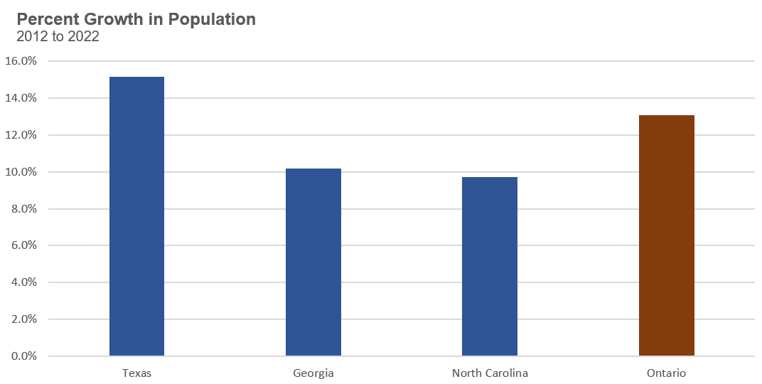
From above, we can see that all three states have experienced significant growth in their population, ranging from 9.7% in North Carolina to 15.1% in Texas. Ontario saw its population grow by 13.1% over the same period.
Since the population in Texas is increasing even more rapidly than that of Ontario, it would be helpful to compare how home prices in a number of additional cities in Texas with elastic housing supply are changing. This will help us understand how home prices change in a rapidly growing state like Texas, whose major cities have a relatively elastic supply of housing.
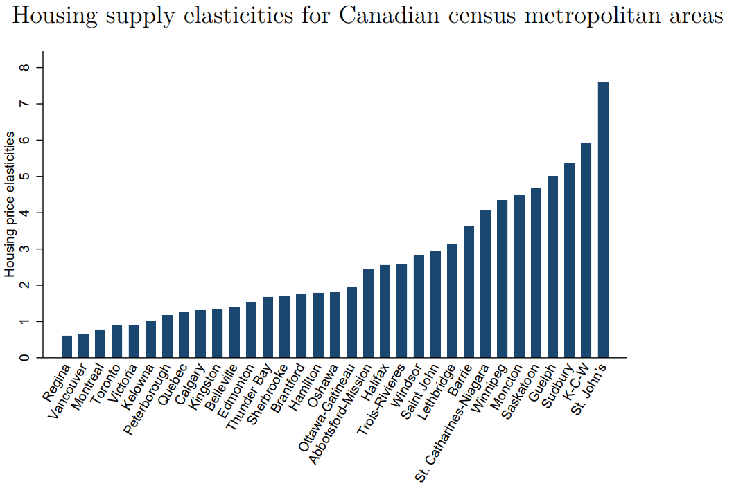
The chart below compares the growth in home prices between 2012 and 2022 in a number of major cities in Texas, along with Atlanta and Charlotte. The cities are ordered by their housing supply elasticity, with the most elastic markets on the left (based on a paper by Albert Saiz). However, it is important to note that all of these U.S. cities have relatively high home supply elasticities as compared to Toronto.
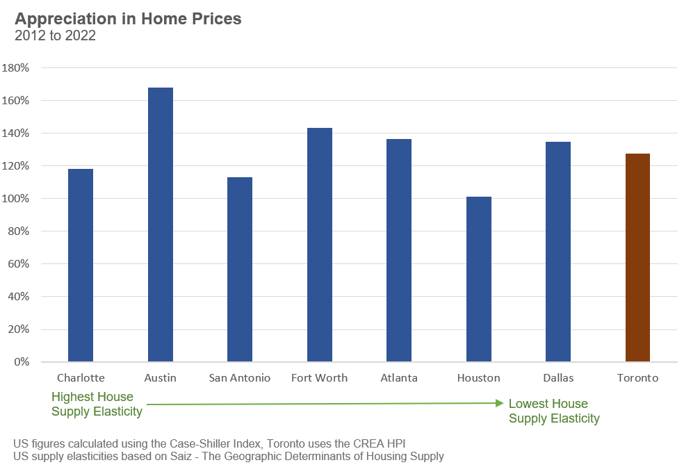
It’s clear from the data above that these housing markets in the U.S. with high housing supply elasticities have not avoided a surge in home prices the way the theory suggests they should have. Home prices in four of the seven U.S. cities rose more rapidly than in Toronto. Furthermore, even with the second-highest supply elasticity, Austin saw home prices rise the fastest.
It’s worth noting that if we look back to the late 1990s and early 2000s, the price growth in all of the above U.S. cities was relatively modest when compared to a U.S. city like San Francisco, which has an inelastic supply of housing. But over the past ten years, four out of the seven U.S. cities with an elastic supply of housing saw prices rise even more rapidly than San Francisco.
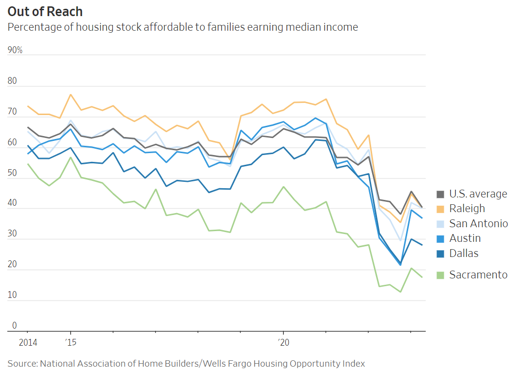
This rapid rise in home prices has deteriorated housing affordability in Texas. A recent report from the Wall Street Journal found that the percentage of homes affordable to families earning a median income has plummeted since 2014.
It’s beyond the scope of this report to explain why this unexpected finding is happening — further research into each local situation is required. But the price growth appears to contradict what politicians and academics have been telling Canadians — that high home prices are caused by cities restricting housing supply and that if cities remove these restrictions, housing will be more affordable.
Let’s now turn to Ontario’s housing market to compare how home prices have changed across cities with far more elastic housing supply than that of Toronto.
The Bank of Canada has calculated the housing supply elasticity for a number of major cities across Canada, as seen in the chart below.
From the above, we can see that of all southern Ontario cities, which are the most densely populated in the province, Toronto has the lowest housing supply elasticity while London, Kitchener-Waterloo, Guelph, St. Catherine’s-Niagara, Barrie and Windsor have the highest. London, with a housing supply elasticity of 19.6, was excluded from the Bank of Canada’s chart for visualization purposes.
Again, per the academic theory, these cities should see a more modest increase in home prices when compared to Toronto.
The chart below shows the growth in home prices from 2012 to 2012 for the above cities. Cities are ordered by their housing supply elasticity, with cities with the highest elasticity on the left.
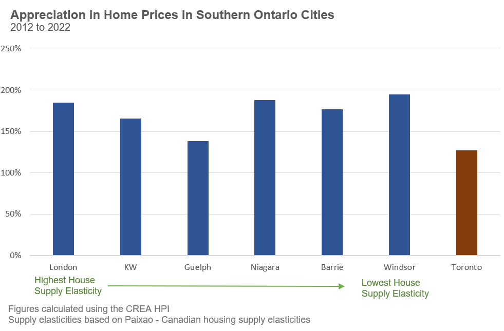
From above, again we see that the theory does not really stand up to reality. All six cities in southern Ontario that have higher housing supply elasticities saw home prices rise more rapidly than in Toronto.
This does not mean cities should not introduce policies that encourage more housing. Canada needs to build more housing, and policies that speed up the approval of new housing and encourage more density are important steps in increasing the supply of housing. However, the above results suggest that high home prices are not only due to barriers restricting the housing supply.
If our governments and academics cannot point to a single country or state anywhere in the world that has rapidly increased its supply of housing amidst a rapid population boom to keep home prices affordable, then are their promises to Build, Build, Build! our way out of this housing crisis an honest solution, or an unattainable goal that will only drive home prices higher?
I suspect the latter.
The fact is that the supply of housing is relatively fixed in the short-term. Our federal government can estimate the number of homes that will be completed over the next year or two based on the number of homes under construction today.
Suppose our government allows Canada to grow by over 1 million people per year (three times faster than historical trends and among the fastest growth rates in the world) in a year when they know only 200,000 homes are going to be completed. In that case, they have decided to allow housing prices and rents to be pushed up, pushing more people and families into housing unaffordability and worse.
When our government keeps making this same decision year after year, we end up with a housing crisis and a housing shortage that keeps getting worse.
Our federal government appears to have wanted all of the economic benefits that a rapid population boom brings without investing any time into considering where everyone will live. Now that all Canadians, especially the poorest households, are experiencing the negative effects of rapidly rising housing costs, our federal government is trying to blame cities for their decisions that are the primary cause of Canada’s housing crisis.
We should all be more suspicious of these claims.
House sales (low-rise freehold detached, semi-detached, townhouse, etc.) in the Greater Toronto Area (GTA) in September 2023 were down 7% over the same month last year.
New house listings in September were up 49% over last year.
The Months of Inventory ratio (MOI) looks at the number of homes available for sale in a given month divided by the number of homes sold in that month. It answers the following question: If no more homes came on the market for sale, how long would it take for all the existing homes on the market to sell, given the current level of demand? The higher the MOI, the cooler the market is. A balanced market (a market where prices are neither rising nor falling) is one where MOI is between four to six months. The lower the MOI, the more rapidly we would expect prices to rise.
While the current level of MOI gives us clues into how competitive the market is on-the-ground today, the direction it is moving in also gives us some clues into where the market may be heading.
The MOI for houses increased sharply from 1.3 in May to 3.8 in September, signaling a rapidly cooling down market.
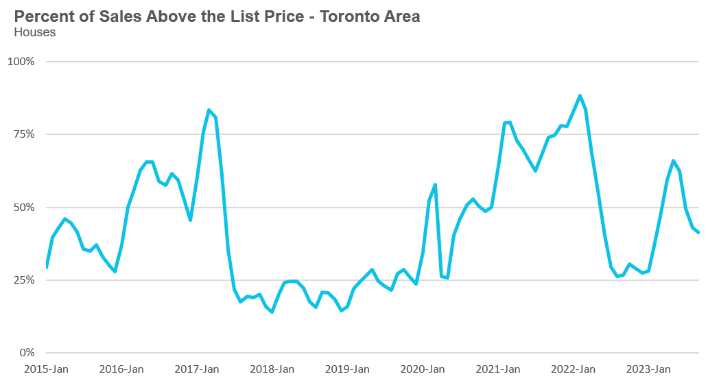
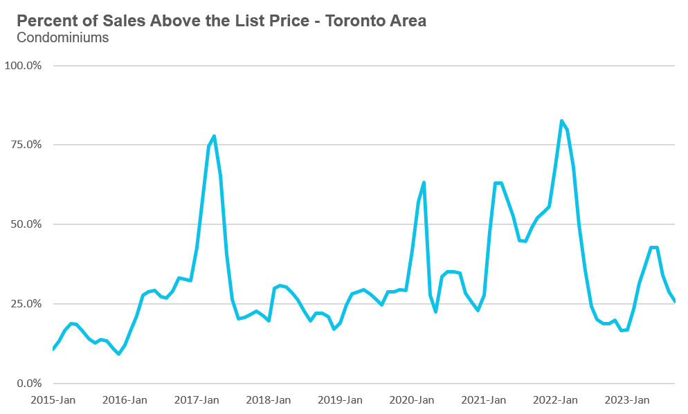
The share of houses selling for more than the owner’s list price decreased to 41% in September.
The average price for a house in September was $1,366,876 in September 2023, up 6% when compared to the same month last year.
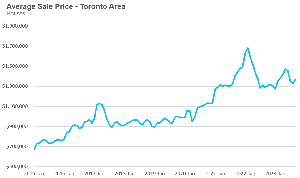
The median house price in September was $1,181,000, up 4% over last year.
The median is calculated by ordering all the sale prices in a given month and then selecting the price that is in the midpoint of that list such that half of all home sales were above that price and half are below that price. Economists often prefer the median price over the average because it is less sensitive to big increases in the sale of high-end or low-end homes in a given month which can skew the average price.
Condo (condominiums, including condo apartments, condo townhouses, etc.) sales in the Toronto area in September 2023 were down 2% over the same month last year.
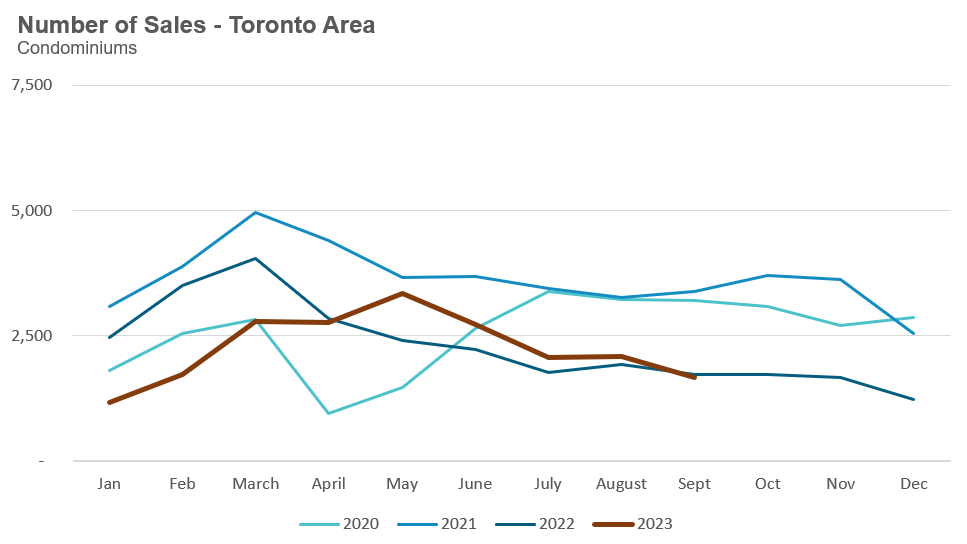
New condo listings were up 43% in September over last year.
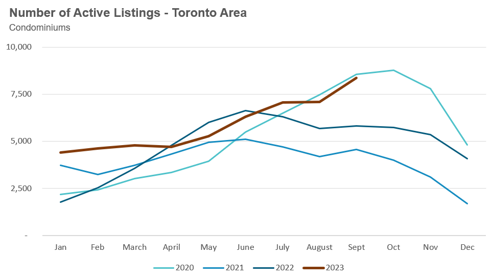
The number of condos available for sale at the end of the month, or active listings, was up 44% over last year.
Condo months of inventory increased from 1.6 in May to 5.1 MOI in September, a sign that the condo market is rapidly cooling down.
The share of condos selling for over the asking price declined to 26% in September.
The average price for a condo in September was $735,366, down 2% over last year. The median price for a condo in September was $670,000, unchanged compared to last year.
Average house prices were up across the GTA last month, while sales were down across all four suburban regions but up in Toronto. New listings were up significantly across all five regions. The MOI is well above last year’s levels, suggesting the market for houses is cooler this year compared to last year.
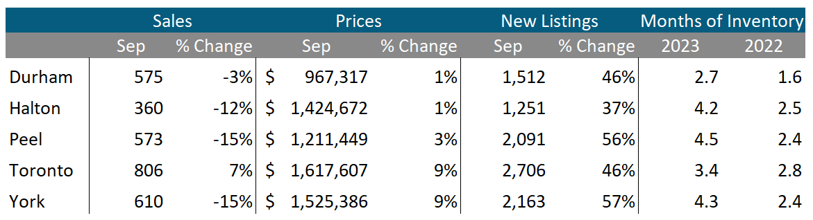
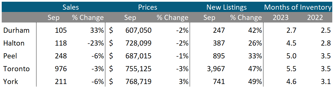
Condo sales were down in Halton, Peel, Toronto and York while Durham saw sales increase over last year. Average prices were down slightly across in all regions except York which saw a slight increase. New listings are up significantly across the GTA. The MOI is above last year’s level, suggesting a cooler market.
See Market Performance by Neighbourhood Map, All Toronto and the GTA
Greater Toronto Area Market Trends
