


John Pasalis in Toronto Real Estate News
For those who missed the headlines last week, the Toronto Real Estate Board announced their bleak sales figures for October 2008. The number of houses sold in the greater Toronto area dropped by 35% over last year and prices declined by 13% in the city of Toronto and by 8% in the 905 region.
Earlier this week I posted a report that discussed how the city of Toronto land transfer tax inflated real estate prices during the fourth quarter of 2007 and how this is now exaggerating the price decline in Toronto. Many purchasers of high end homes rushed into the market towards the end of 2007 to beat the January 1, 2008 deadline to avoid the tax. This resulted in a significant increase in the number of high end homes selling during the final quarter which inflated average home prices during that period.
But the land transfer tax does not help us explain why prices in the 905 region declined by 8% and it also does not explain why more affordable MLS areas are seeing a significant decline in average prices. I decided to dig a little deeper into TREB’s most recent MarketWatch report so see what’s driving the slowdown in some of the worst performing MLS areas.
Here’s a summary of the MLS areas that recorded the biggest decline in prices for October 2008.

I decided to take a closer look at the five worst performing MLS areas in the city of Toronto and for the 905 region I decided to focus on N01, N02 and N03 which covers the Richmond Hill area. The N02 and N03 MLS areas are not listed above but they both posted double digit declines in average home prices. I focused on these 905 regions because of their proximity to Toronto and to each other.
I started by looking at the sales statistics across the different housing types (detached, semi, condo apt etc) to see which segment if any could explain the decline in prices for each MLS area. If we take a closer look at C11 for example we get the following change in average prices across the different housing types.

At first glance it appears as though the Condo Townhome segment is pulling down the average price for houses in C11. But when we look at the sales data for both years, we see a very different story.

Here we see that sales for higher priced detached homes declined by 89%. In October 2007 detached homes accounted for 38% of the sales in C11 and in 2008 detached homes accounted for just 11% of sales. Even if actual property values remained constant, the decline in sales of higher priced detached homes would push average prices down for the period.
The following chart shows the percentage decline in sales from 2007 to 2008 for homes priced under $400K and homes priced over $700K. Each of the MLS areas saw a bigger decline in sales of houses priced over $700K, including those in the 905 region. This suggests that at least part of the decline in sales can be attributed to the fact that sales of higher priced homes are slowing at a faster rate than lower priced homes.
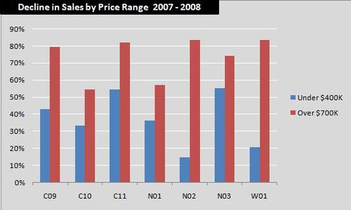
I excluded W09 from the above chart because it did not have any sales above $700K. But if we look at the sales figures for W09, we get a very similar story to the one above. The average price for a house in the area was $260,155 in October 2008, a 23% drop over the previous year. But by looking at the sales figures we can see that the entire decline in sales was in either detached or semi-detached homes which are the two more expensive housing styles in the area. The decline in sales of higher priced semi’s and detached homes in that MLS area helped drive down average prices last month.

These are some good example of why average prices alone may not tell the entire story for a neighbourhood, MLS area or city. Average prices declined in all of the above areas but did they fall because every house in the area was suddenly worth 20%-30% less or did average prices drop because sales of higher priced homes declined faster than sales of lower priced homes?
In the case of the Greater Toronto Area, I suspect that we’re seeing some modest declines in property values but this is being exaggerated by the fact that sales of higher priced homes are declining faster than sales of lower priced homes.
John Pasalis is a sales associate at Prudential Properties Plus in Toronto and a founder of Realosophy. Email John
November 13, 2008
Market |