John Pasalis in Toronto Real Estate News
The overall mood about the current state of Toronto’s real estate market typically depends on the two most commonly reported statistics in the press, average price and sales volume. Average price is a popular measure but can be easily skewed by changes in the housing stock being sold.
I often have clients ask me for a list of the best and worst performing neighbourhoods in the city, based solely on changes in average price. The problem with this approach is that average prices can be very easily skewed. For example, if a new condo with average priced units is completed in a neighbourhood well known for expensive detached homes, the average price for that neighbourhood will fall not because house values have dropped but because the condominium units are having a negative effect on average prices.
The other commonly reported figure in the press is the change in sales volume calculated by comparing the current month’s sales to sales in the same month in the previous year. This is an important measure because it gives us a clear picture of how strong the demand is for housing in any given month. From October 2008 to February 2009 Toronto experienced a significant decline in sales when cautious home buyers jumped to the sidelines at the height of the crisis in financial markets. We can see consumer confidence improving over the past couple of months as more buyers are jumping back in to Toronto’s real estate market.
But while changes in sales volume is an important variable to track, it really only gives us one side of the equation, the demand side. It tell us nothing about the supply of homes on the market which can have just a big an impact as changes in demand.
A measure I turn to often is the sales-to-inventory ratio. This measure is a ratio of the total number of homes that sold in a particular month divided by the total number of homes that were available for sale in that month.
The sales-to-inventory ratio is a key measure of our real estate market because it takes both supply and demand into account telling us how balanced our market is.
A sales-to-inventory ratio of 50% means that one in every two houses sold in a given month, a sign of a hot market. A sales-to-inventory ratio of 10% means that only one in every ten houses sold in a given month, a sign of a much cooler real estate market.
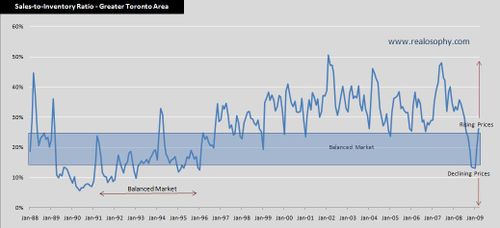
I’ve published the above chart several times in previous posts. It shows Toronto’s monthly sales-to-inventory ratio since 1989.
A sales-to-inventory ratio in the range of 15%-25% suggests a balanced market with little change in house values. A ratio below 15% moves us into Buyer’s market territory and often results in a drop in prices. Values above 25% are a sign of a seller’s market where rising prices are the norm.
The best way to really see the relationship between the sales-to-inventory ratio and changes in home prices is to layer both measures on the same chart. The following chart shows the sales-to-inventory ratio along with the percentage change in home prices for each month.
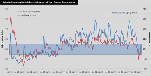
The first thing that stands out is the high correlation between changes in the sales-to-inventory ratio and changes in house prices. This chart is showing us a basic economic principle at work, how changes in the balance between the supply and demand impacts prices.
We know from Economics 101 that in a balanced market where supply equals demand we reach an economic equilibrium and expect to see virtually no change in prices. Once demand exceeds the supply of goods available, prices begin to rise to adjust for this imbalance. Conversely when the supply of goods exceeds the current demand prices begin to fall.
In the case of the real estate market, we appear to reach an equilibrium level of supply and demand when roughly 2 houses sell for every 10 houses available for sale on the market, or in other words a sales-to-inventory ratio of 20%. Calculating an equilibrium level of supply and demand is not an exact science which is why we tend to use the 15% to 25% range of the sales-to-inventory ratio to show a balanced market.
In rational markets, we expect changes in the balance between supply and demand to have an immediate impact on prices. Note that the sudden decline in the sales-to-inventory ratio over the past six months in Toronto resulted in a corresponding decline in prices.
Compare this to the irrational real estate bubble in 1989. During the last boom the sales-to-inventory ratio dropped to 11% in April 1989 and remained below the 15% level for the next two years. This imbalance between supply and demand should have resulted in an immediate decline in house values but prices continued to rise for the next 11 months. This irrational rise in house values is a traditional characteristic of real estate bubbles, when prices rise not because of any economic fundamentals but because people simply expect them to. Year over year prices didn’t start to decline until March 1990.
Understanding Toronto’s real estate market doesn’t have to be complicated. We don’t need degrees in Econometrics to understand the most salient economic principles that affect the real estate market. In this case, it’s the idea that as the supply of homes exceeds the demand from buyers, prices will fall. Had home buyers in 1989 been mindful of this principle and had they invested some time to look at a few numbers, they would have seen the crash coming up to a year before prices started to fall.
John Pasalis is the Broker owner of Realosophy Realty Inc in Toronto. Email John
Published: April 23, 2009