John Pasalis in Toronto Real Estate News
Editor's Note: Due to spam and trolling issues, Move Smartly's comments have been disabled. But we still want to hear from you! Please feel free to send our writers comments, concerns and questions by using the email addresses found at the bottom of posts. Follow up discussion may be featured in future blog posts.
The Toronto Real Estate Board (TREB) recorded 6,564 sales in July 2010, a 34% drop over the same month last year. This figure is understandably startling, but is it significant?
After reading the coverage of TREB’s press release by the Toronto Star, Globe and Mail and National Post, I'm not sure the mainstream media is digging behind the numbers.
As I’ve mentioned in previous blog posts, when looking at percentage change in sales, you need to add in the supply side of the story to really understand the state of Toronto’s housing market.
TREB reported 10,825 new listings in July 2010, the lowest number for a July since 2002. This decline in new listings is noteworthy for a couple of reasons.
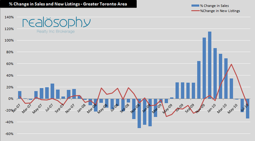
Despite the increased demand we saw in Toronto’s housing market during the second half of 2009, the number of new listings coming on the market continued to fall until December of that year. We then saw a rapid increase in the number of new listings coming on the market peaking in April when we saw a 59% increase in new listings (compared to the same month in the previous year?). When listings surged, we started seeing fewer multiple offers as buyers enjoyed more choice. In some cases, houses that would have received multiple offers just two months earlier received none.
In speaking to clients, it appears that some sellers are responding to this changing landscape by delaying or postponing the sale of their homes. In just a few months we have gone from a market with a 59% increase in new listings to a 11% decline in new listings.
This rapid decline in new listings is a good news story for Toronto’s real estate market.
The following chart compares the % change in sales with the % change in new listings, or put another way, it compares the % change in demand with the % change in supply of homes.
The chart below shows the % change in average prices during the same period.
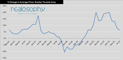
For most of 2007, the demand for homes was up and the supply of homes each month was either flat or negative. This imbalance between supply and demand drove prices up in 2007.
In 2008, we saw sales drop, but new listings increase each month which resulted in a decline in prices beginning in September of that year.
By mid 2009, sales increased significantly, but the number of new listings continued to fall which contributed to the rapid price appreciation we saw during the second half of 2009.
In each of the periods above, demand and supply were moving in opposite directions which contributed to the relatively rapid price appreciation and depreciation we experienced.
Had the volume of new listings last month continued to rise as demand declined, I would be inclined to think that we are moving closer to a period of declining prices. But the fact that the declining demand for houses is being matched by a decline in supply suggests to me that we are moving to a more balanced market with moderate price appreciation.
John Pasalis is the Broker Owner of Realosophy Realty Inc in Toronto. Realosophy focuses on researching Toronto neighbourhoods to help their clients make smarter real estate decisions. Email John
Published: August 05, 2010