John Pasalis and Urmi Desai in Toronto Real Estate News

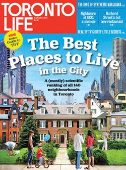
Realosophy spends a lot of time analyzing neighbourhood data so we appreciate that ranking neighbourhoods can be a tricky business. So the team picked up Toronto Life’s latest issue with great interest – we’ve done some analytics work for the magazine’s previous real estate issues and appreciate all the work that goes into the magazine’s constant churn on Toronto’s real estate market. For Toronto Life’s latest offering, a ranking of all 140 City of Toronto neighbourhoods, they partnered with the academics at the Martin Prosperity Institute at the University of Toronto.
The list is (and is probably designed to be) an eyebrow-raiser: Rosedale-Moore Park tops the list as the best neighbourhood in Toronto, Mount Denis is the worst, with Malvern (#27) ranking ahead of Trinity-Bellwoods (#41) in between.
Let’s leave aside for now whether it’s even useful to rank completely different kinds of neighbourhoods against each other, not to mention the magazine’s claim that Torontonians engage in “cutthroat” competition to be number one (does this involve hurling bags of hot poo into other people’s dog parks?)
It’s not unusual for overall rankings to have some odd results; overall rankings rarely make sense because they weigh a number of different factors to come up with one overall score. Far more important are the category level rankings (housing, crime, transit and so forth) – and when your category specific rankings don’t make any sense to the people who live them, you know you have a real problem.
Does it make sense to any Torontonian that The Beach would rank more highly on the transit ranking (#29) than Playter Estates-Danforth (#70), home to the Broadview subway station and the DVP? As a previous issue of Toronto Life itself highlights, Playter Estate-Danforth is home to perhaps the most coveted elementary school in Toronto, Jackman Avenue Junior PS, so it’s #95 ranking and 1/100 score is just mystifying.
It’s all resulted in a predictable but nonetheless entertaining WTF? comment section at www.torontolife.com, furthering the impression that the aim is social media baiting starting a conversation. Which is completely understandable for a lifestyle magazine. But the involvement of the Martin Institute is disconcerting. As a high-profile social science institution, engaged by the provincial government among others, we would hope that it would be at the forefront of efforts to show how the use of data can help society make better decisions – whether it’s helping city officials improve neighbourhoods or consumers make better lifestyle decisions – laughable results may be a genuine cause for concern if it lessens credibility with the public.
Now, we know data exercises can spit out the crazy. Twice a year, in preparing our analytics for the Globe and Mail neighbourhood appreciation report, we see numbers that don’t make sense to us because of our knowledge of real estate on the ground, which results in hours of checking and re-checking our work.
Problems of the sort we see in the Toronto Life list are generally due to either 1) poor quality data or 2) a flawed economic model/assumption. When combined, compounded errors can add up to big time embarrassments, as two prominent US economists learned earlier this year.
As an example of poor quality data evidenced by the Toronto Life exercise, the average price for a detached house (the predominant form of housing) in Playter Estates hasn’t been $545K in close to ten years. Doing a basic “sniff test” of the results at this level allows an analyst to both check their data compiling processes and verify their data sources when things don’t look right.
As for methodology, we are not so much confused as clueless. There appears to be no explanation of how each score (crime, transit and school and so on) is compiled out of 100. We are vaguely told housing is some combination of “year-over-year appreciation” and “ratio of average price to household income”; more importantly, we are not told why this method is chosen. Depending on how it’s calculated, one effect of this metric would be to discount neighbourhoods with a high percentage of renters – is this the intention?
No data analysis is a bulletproof, perfect response to any one question. Each is best considered a way to get to the right answer. That’s why it’s important to disclose the methodology used so that readers can decide if an author or organization’s assumptions make sense to their own decision-making.
With no methodology to review, and with a series of results that defy on-the-ground realities, the average reader can only conclude that the economists at the Martin Prosperity Institute – Toronto’s leading think-tank on the role of location, place and city-regions in global economic prosperity – have nothing to teach us about neighbourhoods.
We think this would be the wrong conclusion to reach – not only about the Institute, but about the exercise of data analysis in general. Hopefully, this effort will be appreciated by readers for what it is, an attempt, however imperfect. And hopefully we’ll soon be able to thank Toronto Life and the Martin Institute for continuing the conversation by spurring better efforts from others.
John Pasalis is the President and Broker of Realosophy Realty Inc. Brokerage in Toronto. A leader in real estate analytics and pro-consumer advice, Realosophy helps clients buy or sell a home the right way. Email John
Urmi Desai is editor of the Move Smartly blog and is responsible for strategy and marketing at Realosophy Realty Inc. Brokerage. A leader in real estate analytics and pro-consumer advice, Realosophy helps clients buy or sell a home the right way. Email Urmi
August 20, 2013
Market |


