FREE PUBLIC WEBINAR: WATCH REPORT HIGHLIGHTS & Q/A - Thursday April 13th 12PM ET

Join John Pasalis, report author, market analyst and President of Realosophy Realty, in a free monthly webinar as he discusses key highlights from this report, with added timely observations about new emerging issues, and answers your questions. A must see for well-informed Toronto area real estate consumers.
When the housing market started to heat up at the start of this year, I commented on Twitter that most of the sale prices I was seeing, despite houses getting multiple offers, were within the home’s market value. But some homes were getting aggressive prices well above what recent comparable sales could justify and if this trend continued these outlying sale prices would eventually nudge prices higher. That is exactly what happened over the past couple of months.
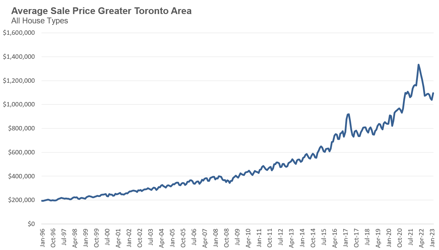
The average price for a low-rise house in the GTA since July has hovered in the $1.3M range. But in February 2023, average prices reached $1.352M, and in March 2023 they reached $1.378M. The average and median price for houses are at their highest level since May 2022.
This upwards pressure on house prices has largely been due to the demand for homes outpacing the supply of new listings coming on the market which has pushed current months of inventory of houses to just over 1 month, the lowest level of inventory since April 2022.
While condos have also seen inventory levels decline rapidly since the fall market, we are not seeing this reflected in average or median prices yet. Average condo prices have hovered around $730K since July 2022.
I believe that we’re not seeing as much price pressure on condo prices yet because the market, while tightly supplied, is not as competitive as the market for houses. Many houses are receiving 10 to 20 offers on their offer nights, something we rarely see in the condo market right now. There are more people competing for a low-rise single family house than there are buyers trying to buy a condo today.
Unless we see a dramatic increase in the number of house being listed for sale, I expect the housing market to remain competitive in the months ahead.
Last month NDP Member of Parliament Daniel Blaikie had this to say about rapidly rising housing prices in Canada in the House of Commons:
“House prices doubled every few years under the last Harper Conservative government so don’t tell me that somehow this [housing crisis] is a product of just the last little while”
I originally stumbled across this clip from National Observer columnist Max Fawcett who shared it and commented - “Every word of this speech is correct”. I figured this would be a fine topic for this month’s Data Dive to test whether Blaikie and Fawcett’s claims are in fact correct.
While I did take a look at this question in 2021 in a piece titled How Toronto Home Affordability Ran Away Under Justin Trudeau, I thought it would be worth revisiting this topic with some new data and some different methodologies since Blaikie and Fawcett (and many others) appear to be confused the timing of recent trends in our housing market.
I’ll start by saying that my analysis will be based on the Toronto Area’s housing market vs Canadian home prices more generally; however, since Toronto makes up the biggest share of national sales and is among the least affordable cities in Canada, along with Vancouver, it should give us a telling insight into the timing of the onset of Canada’s housing affordability crisis.
When we look at a chart of average home prices in Toronto, we can see that home prices have been trending up since the mid 1990s.
Indeed, I saw someone share a chart like this on Twitter as evidence that our housing crisis isn’t recent, but has been going on for decades.
The problem with this argument is that simply looking at a chart of home prices over time doesn’t really tell us how rapidly prices are changing over that period — in other words, has the rate of appreciation in home prices been constant over that entire period or were there some periods that saw a more rapid appreciation in home prices than others?
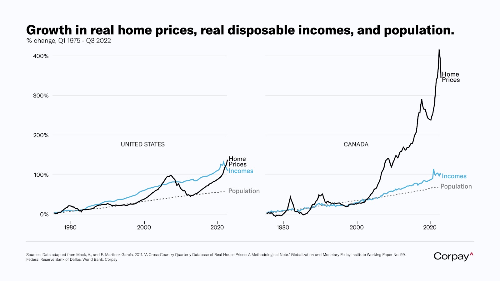
This argument also ignores how home prices have changed relative to incomes over time. The United States, for example, has seen strong growth in home prices, but this has been coupled with strong wage growth which makes their housing market look far less disconnected from fundamentals when compared to Canada.
The following chart is from Corpay Chief Market Strategist Karl Schamotta.
Let’s start by tackling the first question, how has the rate of appreciation in home prices in Toronto changed over time?
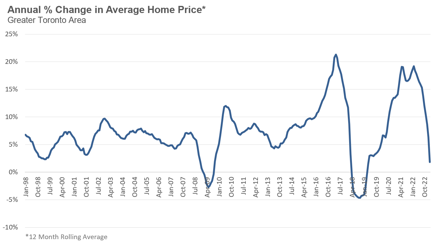
The year-over-year appreciation is simply calculated by looking at the average sales price in a given month and year and comparing that to the same month in the previous year. The chart below shows the annual percentage change in home prices based on a 12-month rolling average of home prices from January 1998 to December 2022.
Note that because I think it’s more important to look at longer-term trends rather than short-term volatile price dynamics, in the above chart, each month’s average sale price is based on the average over the previous twelve months, otherwise known as the twelve month rolling average (“rolling average”). This approach softens the rapid booms and busts in prices, while still capturing the longer term trends in average sale prices.
There are a number of noteworthy trends that stand out.
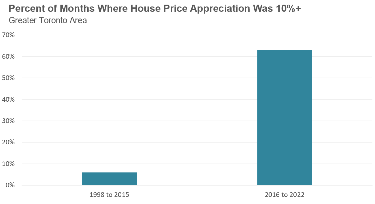
For most of the early period in this chart, the average rate of appreciation in home prices bounced around the 6% range, with some years seeing home prices rise more rapidly or slowly than that. Prior to late 2015, it was extremely rare to see average home prices appreciate by 10% per year or more. Over that entire 18-year period between 1998 and 2015 home prices were up by more than 10% per year during only 13 months, or 6% of the time. Seven of those months were in 2010 as the housing market recovered from the downturn caused by the 2008 global financial crisis while the balance occurred during the second half of 2015.
But in 2016, average home prices started to accelerate well above 10% per year eventually reaching 21% in early 2017.
During the seven-year period between 2016 and 2022, average home prices were up by 10% per year or more during 53 out of the 84 months, or 63% of the time.
When we think about one of the reasons we have seen an increase in the number of people buying investment properties, or refusing to sell their current home when they move out of it, it’s because double digit home price appreciation has recently become the norm rather than the exception for Toronto real estate.
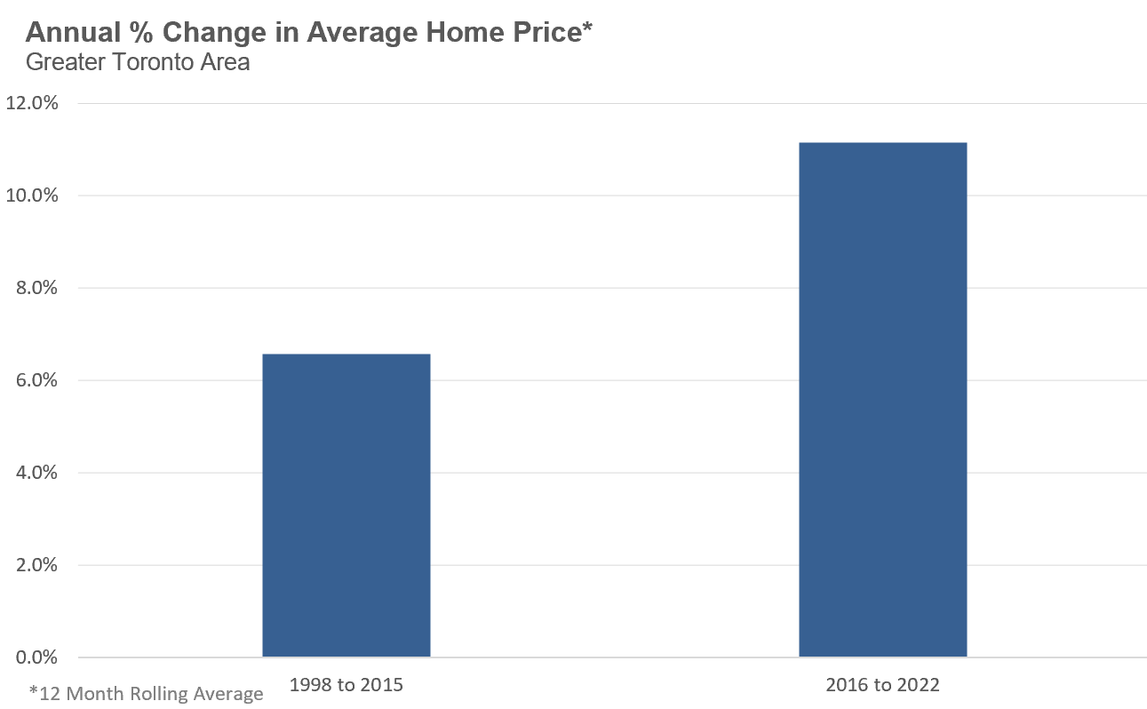
While this chart gives us some insight into how home prices have changed from one year to the next, it doesn’t tell us the overall average annual appreciation over the entire period. To capture this, I’m going to compare the 1998 to 2015 period where single-digit price growth was more common, with the period after 2016 where double digit annual appreciation became the norm.
From the above chart, between 1998 to 2015 home prices in the Toronto area appreciated by 6.6% per year compared to 11.2% between 2016 and 2022. This may not mean a lot to the average person, but it has a material impact on where home prices are today.
If during the 2016 to 2022 period, average home prices continued to appreciate by 6.6% per year vs 11.2% the average price of a home at the end of 2022 would have been $920,000 vs the current average of $1,189,000.
That means that the average home buyer buying in this period has an additional $270,000 balance on their mortgage because of this more rapid growth in home prices.
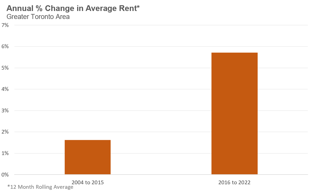
While our rental data does not extend as far back as our house sales data, if we take a similar approach, calculating the annual rate of appreciation using a twelve-month rolling average of rents comparing the period before and after 2016 we see a similar result. The annual rate of appreciation of average rental prices in the Toronto area between 2004 and 2015 was 1.6% vs 5.7% after 2016.
Once again, this may not sound like a big difference, but when you compound this much higher rate of appreciation over years it can have a big impact.
If rents continued to appreciate by 1.6% per year after 2015, the average rent in the Toronto area at the end of 2022 would have been $2,125 vs the actual average of $2,688.
The average renter today is paying $563 per month more in rent because rents have appreciated more than 3x more rapidly since 2016.
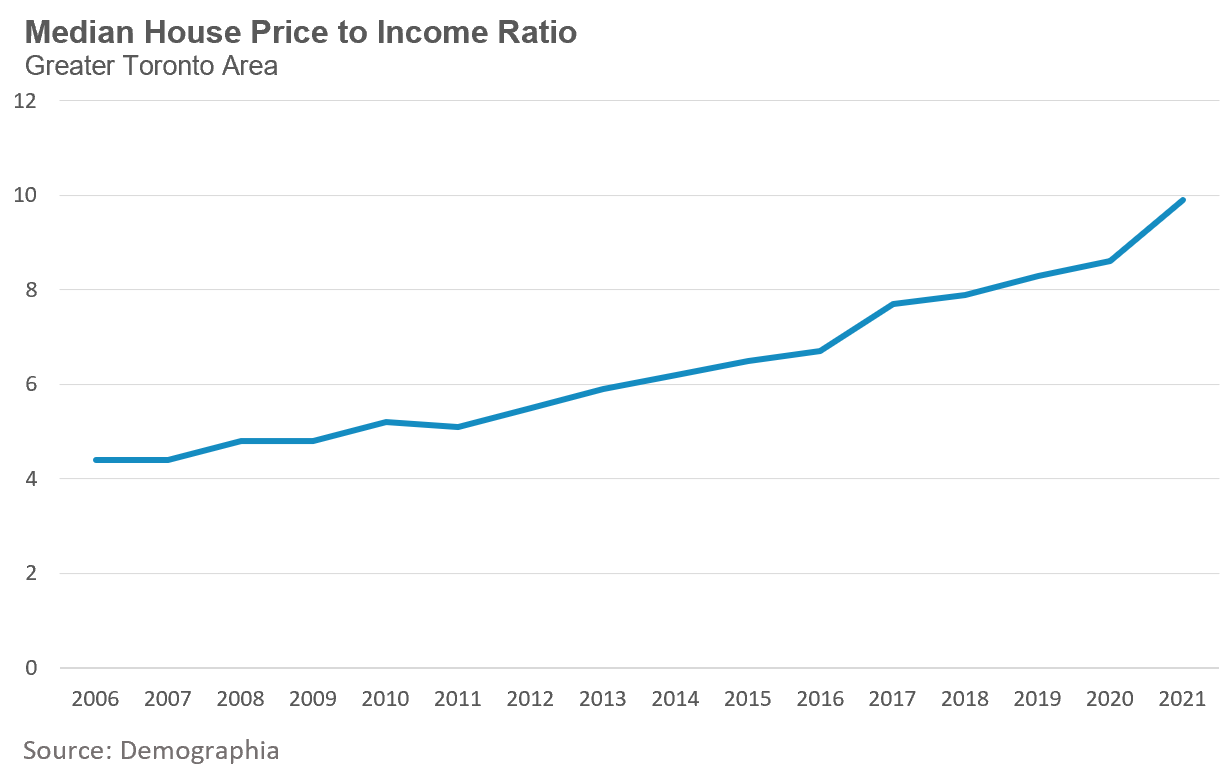
Finally, when we compare home prices against incomes we can see that home prices have been trending up relative to income for some time, but this trend got worse more recently.
Between 2006 and 2015, the median home went from costing 4.4X the median household income to 6.5X household income. In nine years, home prices appreciated by 2X the median household income.
From 2016 to 2022, the median home went from costing 6.7X the median household income to 9.9X household income in 2022. In just five years, home prices have appreciated by 3X the median household income, a far more rapid rate of appreciation in house prices relative to household incomes.
I’ll end by saying that the analysis above compared house and rent price dynamics before and after 2016 because it was in 2016 when home prices began appreciating by over 10% per year.. But whether one wants to use a year earlier or later will not change the underlying fact that home prices and rents have been appreciating far more rapidly over the past 5 to 7 years than they were during the previous 18 years.
What caused home prices and rents to surge more rapidly recently is beyond the scope of today’s Data Dive as this is a complex question.
But if even experts don’t understand that home price and rent dynamics have changed dramatically over the past seven years when compared against the previous two decades, they of course are not going to be able to pinpoint what has changed in this period to cause this more rapid growth in housing costs.
Returning to the politician and columnist that inspired this month’s Data Dive, it should go without saying that Daniel Blaikie’s assertion that home prices were doubling every few years under the last Harper government, and that the housing crisis is not just a product of the “last little while” is incorrect.
While home prices and rents were of course appreciating under the previous Harper government, home prices have been appreciating 2X as fast since 2016 and rents are appreciating 3X more quickly compared to the period before 2016.
Prior to 2016, nobody was talking about an expected housing shortage of nearly 1M homes in Ontario over the next ten years — these are more recent narratives and a product of recent housing market dynamics.
All that being said, when you consider where home prices and rents would have been had they followed the annual rate of growth we saw before 2016, it is accurate to say that this housing crisis is largely a product of the rapid change in housing costs since 2016 rather than a twenty-year problem.
While some are no doubt reflecting their own political biases, I am concerned that a lack of data literacy is also a big problem - it allows politicians and media to make lazy arguments that we need to be able to challenge.
House sales (low-rise freehold detached, semi-detached, townhouse, etc.) in the Greater Toronto Area (GTA) in March 2023 were down 36% over the same month last year and below historic sales volumes for the month of March.
New house listings in March were down 50% over last year and well below historic new listing volumes for the month of March.
The number of houses available for sale (“active listings”) was down 21% when compared to the same month last year.
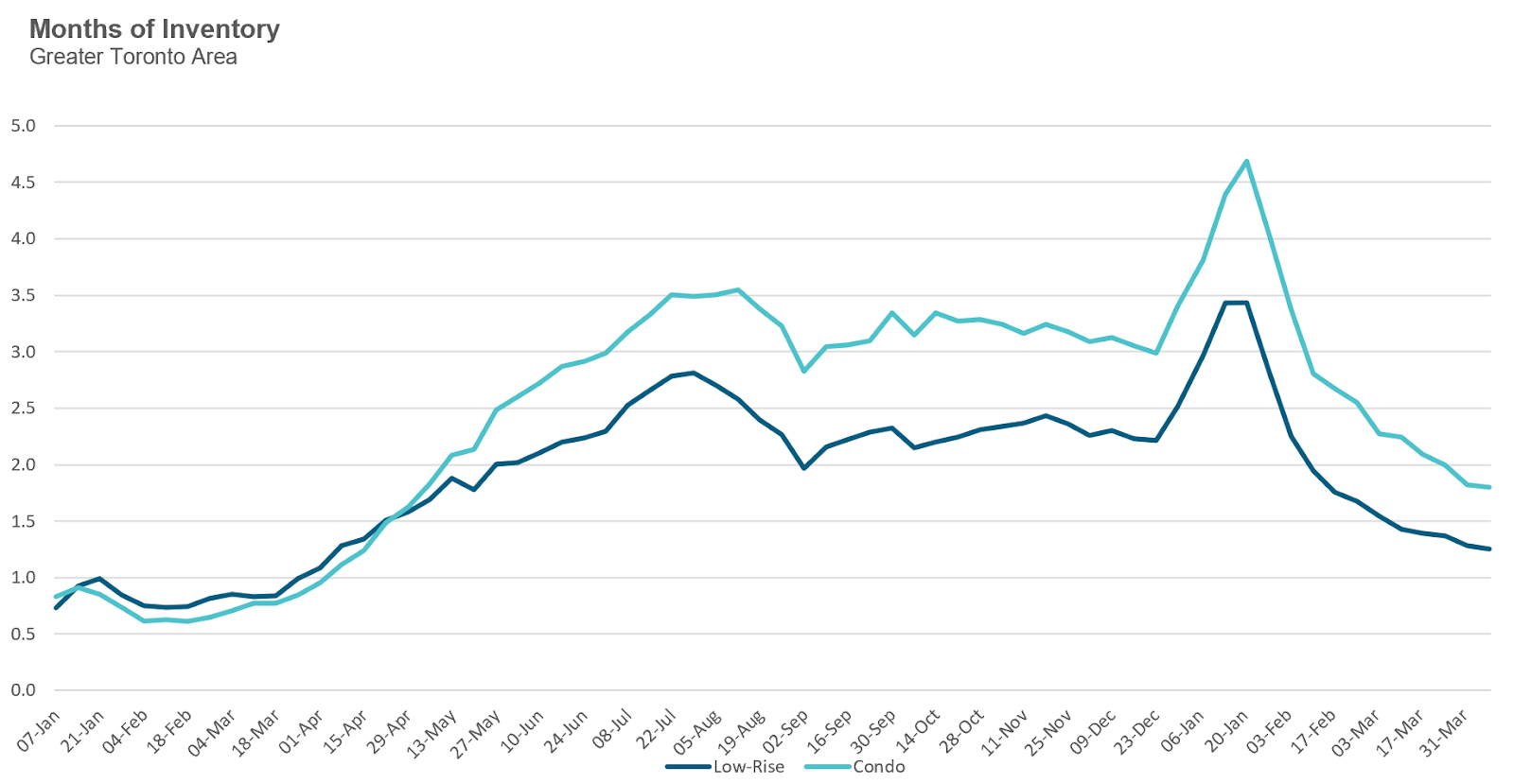
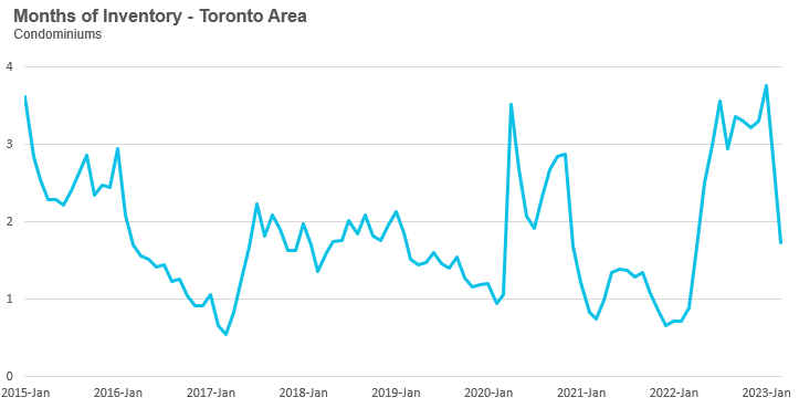
The Months of Inventory ratio (MOI) looks at the number of homes available for sale in a given month divided by the number of homes that sold in that month. It answers the following question: If no more homes came on the market for sale, how long would it take for all the existing homes on the market to sell given the current level of demand? The higher the MOI, the cooler the market is. A balanced market (a market where prices are neither rising nor falling) is one where MOI is between four to six months. The lower the MOI, the more rapidly we would expect prices to rise.
While the current level of MOI gives us clues into how competitive the market is on-the-ground today, the direction it is moving in also gives us some clues into where the market may be heading.
The MOI for houses dropped to 1.2 MOI in March. This puts the housing market deep into seller’s market territory.
The share of houses selling for more than the owner’s asking price increased to 48% in March.
The average price for a house in March was $1,378,772 in March 2023, well below the peak of $1,679,429 reached in March and down 14% when compared to the same month last year.
It’s worth noting that the average price has been relatively flat around $1.3M since July but has begun to trend up over the past two months and is at the highest level since May 2022.
The median house price in March was $1,220,000, down 14% over last year, and below the peak of $1,485,000 reached in March.
The median is calculated by ordering all the sale prices in a given month and then selecting the price that is in the midpoint of that list such that half of all home sales were above that price and half are below that price. Economists often prefer the median price over the average because it is less sensitive to big increases in the sale of high-end or low-end homes in a given month which can skew the average price.
Condo (condominiums, including condo apartments, condo townhouses, etc.) sales in the Toronto area in March 2023 were down 31% over last year.
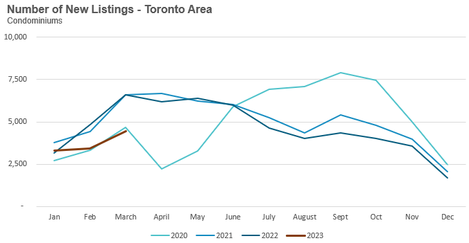
New condo listings were down 29% in March over last year but inline with pre-COVID listings volumes.
The number of condos available for sale at the end of the month, or active listings, was up 35% over last year.
Condo months of inventory levels decreased to 1.7 MOI in March which puts the condo market in seller’s market territory.
The share of condos selling for over the asking price remained unchanged at 31% in March.
The average price for a condo in March was $726,912, down from the peak of $840,444 in March, and down 14% over last year. The median price for a condo in March was $665,000, down 14% over last year, and down from the March peak of $777,000.

Our Regional Trends section typically only compares key statistics for the current month against the same month last year, but for this month’s report I decided to include the trends from last month since it really shows how dramatically inventory levels have declined between February and March of this year.
Houses
Because we are comparing this month’s statistics against the near peak of the housing market last year, sales, prices and new listings are all down by double digits. But the trend that I think is noteworthy is that inventory levels for all five regions are approaching the levels we saw a year ago and this has contributed to the gradual month over month increase in prices across most regions.
Condos
Much like the market for houses, the key statistics for the condo market are also down by double digits across all regions with Durham condo sales the lone exception. While inventory levels for condos are not quite at 2022 levels yet, we can see a dramatic decline when compared to inventory levels in February 2023.
See Market Performance by Neighbourhood Map, All Toronto and the GTA
Greater Toronto Area Market Trends