WithTitle.png?width=367&name=MoveSmartlyCoverMarch2022(375x475)WithTitle.png "MoveSmartlyCoverMarch2022(375x475)WithTitle")

Just over a year ago, in my February 2021 report, I discussed what I saw as signs of a housing bubble in the market for suburban homes in the Toronto area. When I published that report, the average price for a low-rise home in the suburbs was just over $1.21M, up 26% in one year.
A number of big bank economists in March 2021 raised similar concerns that the rapid growth in home prices may at least in part be driven by speculative buying, and they suggested that policy makers might introduce new measures to curb speculation in the housing market.
But no measures were introduced. When Bank of Canada Governor Tiff Macklem said, “we need the growth we can get,” in response to concerns about rapidly rising home prices at the time, it was clear that inflating home prices was part of the Bank’s plan to get Canada out of this pandemic. Since then, data from both Teranet and the Bank of Canada show that demand from real estate investors actually accelerated in 2021, helping to push home prices even higher.
So what’s happened since last year?
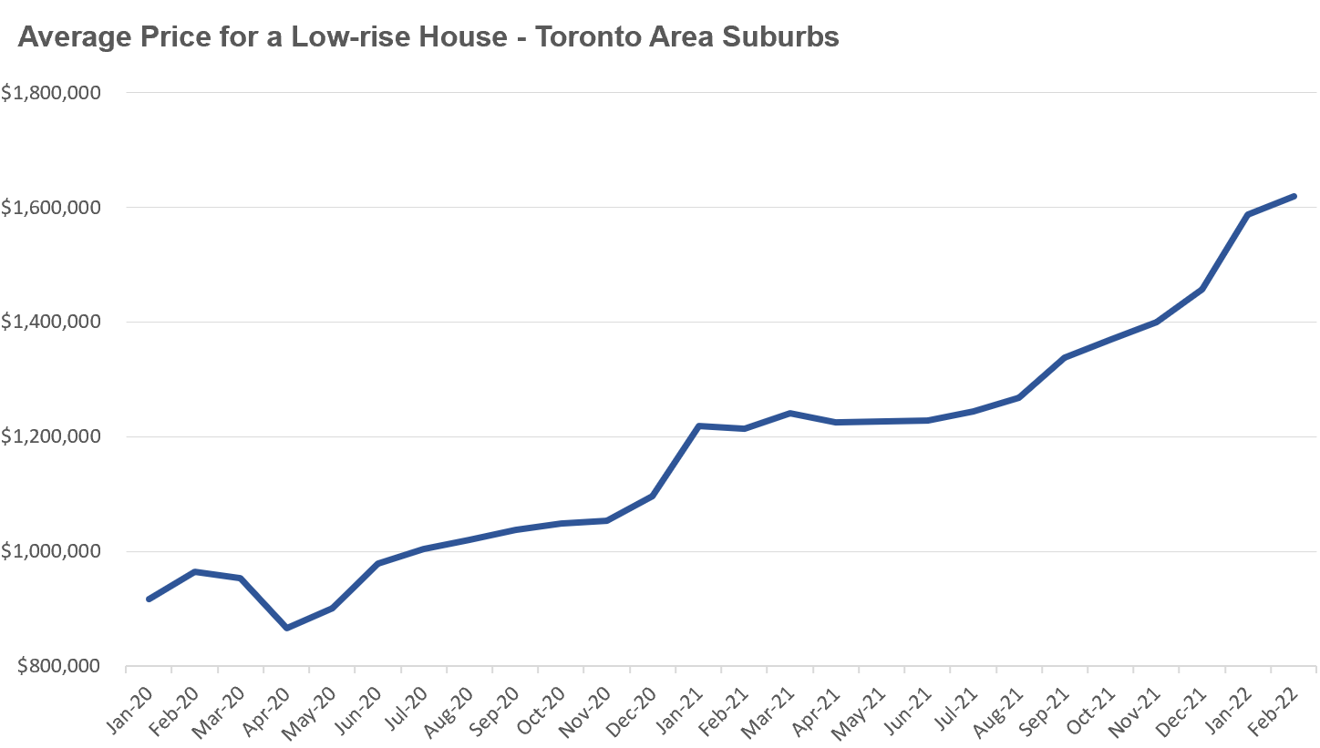
As seen above, over the past year, low-rise suburban home prices have surged from just over $1.21M to $1.62M, a 34% increase.
Over the past two years, low-rise suburban home prices are up 68% so clearly, in spite of some authorities ringing the alarm, they have done little else.
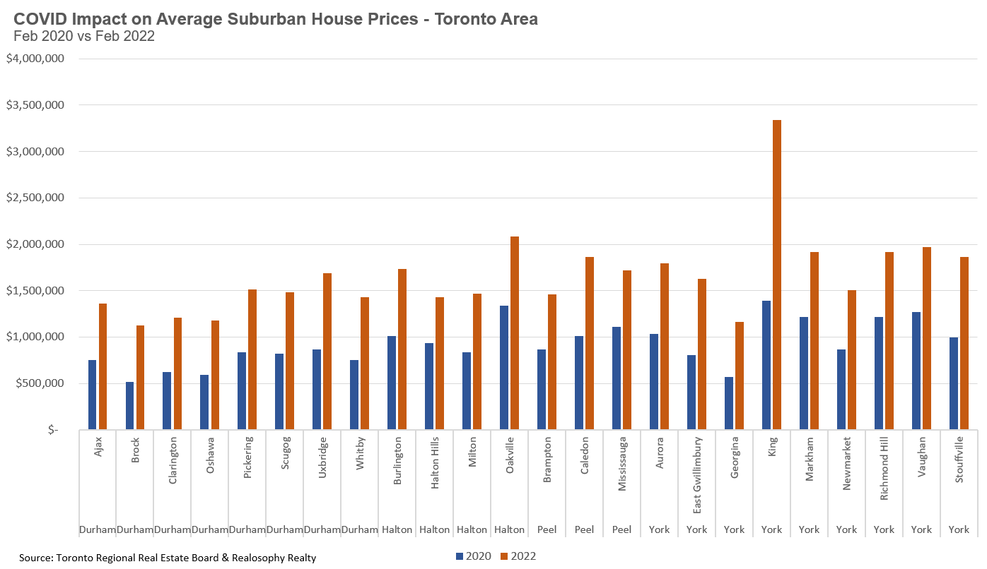
The chart below shows the average price of suburban low-rise homes in February 2020 (pre-COVID) vs February 2022 by municipality. Before COVID, fifteen of Toronto's suburban municipalities had an average price below $1M. Last month, not a single municipality had an average price below $1M.
It is hard to say where the market will go from here, but having this rapid acceleration in home prices as we head into an uncertain economic times due to rising inflation, gas prices surging and potential fallout from the Ukraine conflict is risky. If we find ourselves in a recession a year from now, high home prices and high household debt might make any potential recession even worse.
Conversely, what makes Canada a bit unique from other bubble countries is that its fundamental demand for housing continues to significantly outpace supply. If Canada can meet its lofty immigration targets, the demand for homes will continue to outpace supply, which in theory would put even more upward pressure on prices. But this alone is no guarantee that prices will keep rising at this current rate.
As I mentioned in a previous report, the most important factor to keep an eye on in the months ahead is buyer sentiment as rapid changes in buyer sentiment are one of the key risks of bubbles bursting. If the sentiment of buyers shifts from optimistic to pessimistic, it will be tough for policymakers to counteract that trend.
I was speaking with someone recently who was so used to Toronto’s housing market that he assumed all of the trends and market dynamics we see here are typical and that many cities and countries around the world are experiencing similar trends.
So I thought I’d spend some time in my Data Dive this month to take a look at Canada’s real estate market from an international perspective.
I’m going to start by taking a look at how home prices have changed across G7 countries since 1990.
This chart shows an index of house prices which allows us to compare how prices have changed without worrying about any currency differences. It assumes 1990 is our starting point and then shows how each country's home prices have changed since that time.
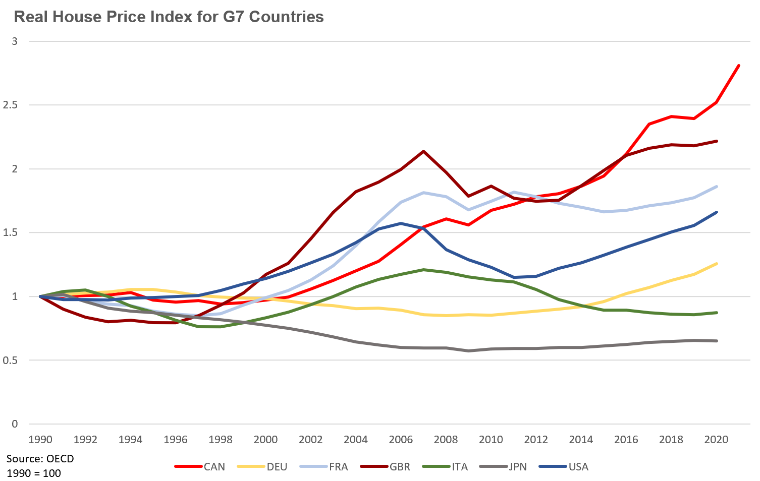
We can see that house prices in Canada have outpaced the rest of the G7.
But changes in prices alone don’t tell the entire story. When economists try to assess whether home prices are overvalued relative to fundamentals, one way they’ll do that is by comparing house prices to rents since rents are effectively the annual dividend income we receive on our rental investment.
Another way of thinking about the relationship between home prices and rents is that if home prices rise too rapidly and owning a home becomes much more expensive than renting, households will be more inclined to rent rather than buy. As more households decide against buying and opt to rent, this takes pressure off of rising home prices and gradually puts upward pressure on rents, eventually moving them back towards equilibrium where households are indifferent between buying and renting. At least in theory, this is the relationship between home prices and rents we should see over time in a balanced market.
One of the metrics economists often use to compare home prices and rents is the price-to-rent ratio. Here’s an example of how the price-to-rent ratio is calculated. If a home sells for $500,000 and the annual rental income is $25,000 (or $2,083 per month) then the price-to-rent ratio is 20 since the price of the home is 20 times the annual rental income. Another way of thinking about this is that if I bought this home strictly as an investment, the rental income (before deducting other expenses) would offer me a gross return of 5% per year since the annual rental income of $25,000 is 5% of $500,000.
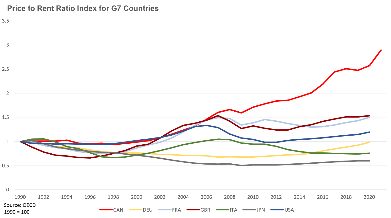
The chart below shows the price-to-rent ratio index for G7 countries. The idea with an index is to measure how the price-to-rent ratio has changed over time — rather than measuring the actual price-to-rent ratio. The chart below sets 1990 as our starting point and then shows how each country's price-to-rent ratio has changed since then.
We can see that by 2006, Canada’s price-to-rent ratio had risen at a similar rate to Great Britain and France.
But since then, Canada’s price-to-rent ratio has accelerated at a much faster rate than all other G7 countries. Canada was the only country with price-to-rent ratio data for 2021.
So what exactly is this chart telling us?
It’s telling us that home prices in Canada have appreciated far more rapidly relative to rents when compared to the other G7 countries — that is, the cost of a home has most rapidly outpaced the rent it earns. In the United States for example, home prices have not appreciated much when compared to rents. In Japan and Italy, home prices have declined relative to rents when compared to their level in 1990.
If we turn our attention to the Toronto area housing market, we can compare the change in the actual price-to-rent ratio over time rather than comparing against an index.
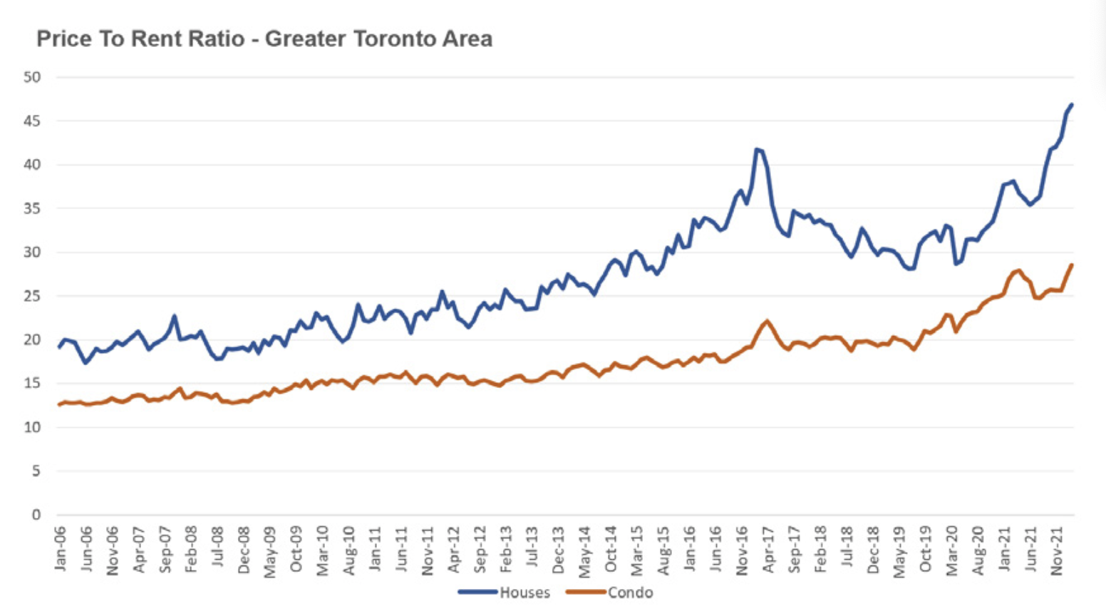
Note that the chart above starts in 2006 as compared to 1990 in the previous charts and reflects average sale and rents from the Toronto Real Regional Real Estate Board’s MLS system.
In February 2022, the average low-rise house sold for $1.68M while the average rent for a low-rise house was $2,992 resulting in a price-to-rent ratio of 47.
The average condo last month sold for $836K and the average rent for a condo was $2,443 resulting in a price-to-rent ratio of 29.
This disconnect between home prices and rents we are seeing in Canada, and Toronto more specifically, is not a normal trend — as we can see above when we compare Canada to other G7 countries.
One key factor I’ve discussed before is that Canada’s population is not only growing twice as fast as any other G7 country, but it’s also growing far faster than our ability to build new homes which is pushing home prices higher. Even if the rents don’t justify today’s prices, the expected future appreciation is what is motivating people to buy homes, or in some cases not sell them when they move out of them.
But we are also seeing signs that rents are accelerating, and not just in the Toronto area where average rents have surpassed pre-COVID levels, but in other parts of Canada as well as people arrive from more expensive parts of Canada.
Renters for the most part have not felt the true high cost of housing in Canada since homeowners have largely been absorbing relatively low rents, but that’s starting to change.
As more people get priced out of the housing market, we will see more demand for rentals which will likely put upward pressure on rents in the years ahead.
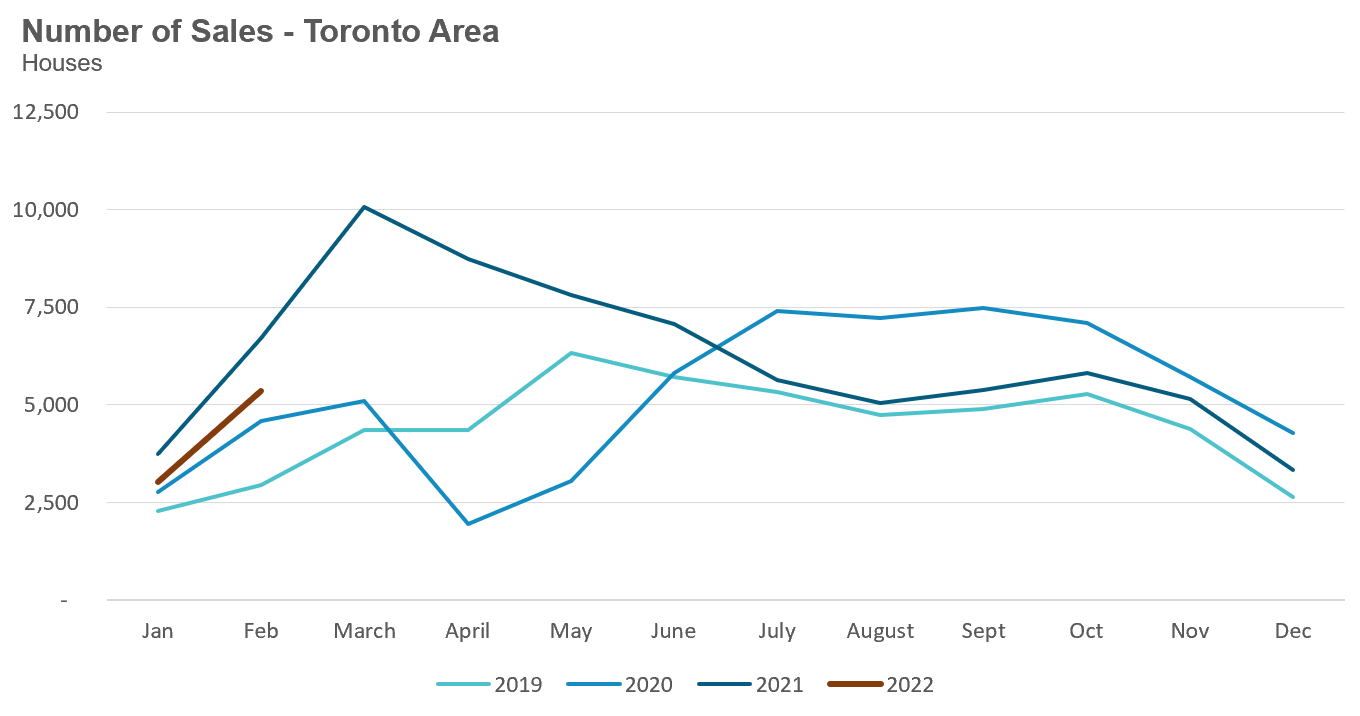
House sales (detached, semi-detached, townhouse, etc.) in the Toronto area in February 2022 were down 20% over the same month last year, but above levels for the same month in pre-Covid 2019 and 2020.
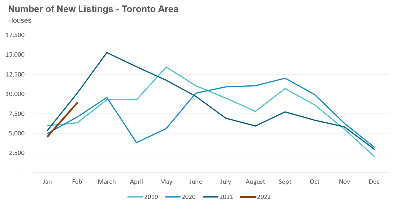
New listings in February were down 12% over last year, and well above the volumes seen in 2019 and 2020.
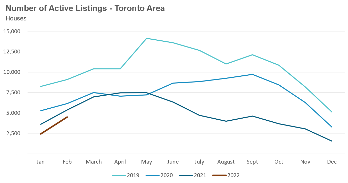
The number of houses available for sale (“active listings”) was down 16% when compared to the same month last year and 27% below the inventory levels seen in 2020.
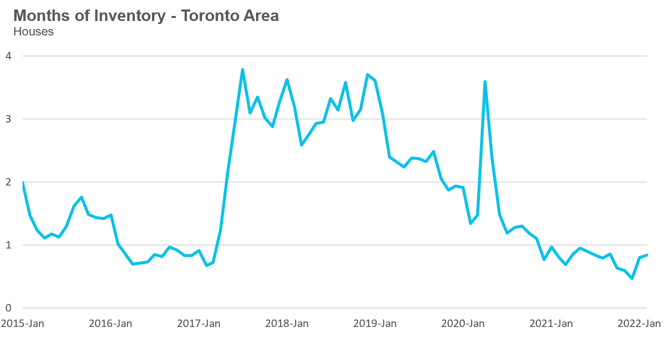
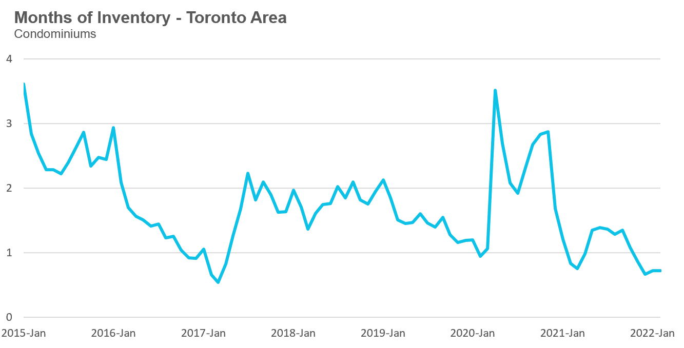
The Months of Inventory ratio (MOI) looks at the number of homes available for sale in a given month divided by the number of homes that sold in that month. It answers the following question: If no more homes came on the market for sale, how long would it take for all the existing homes on the market to sell given the current level of demand?
The higher the MOI, the cooler the market is. A balanced market (a market where prices are neither rising nor falling) is one where MOI is between four to six months. The lower the MOI, the more rapidly we would expect prices to rise.
While the current level of MOI gives us clues into how competitive the market is on-the-ground today, the direction it is moving in also gives us some clues into where the market may be heading.
The MOI has been below a very competitive 1 MOI since last year, but has increased slightly over the past two months.
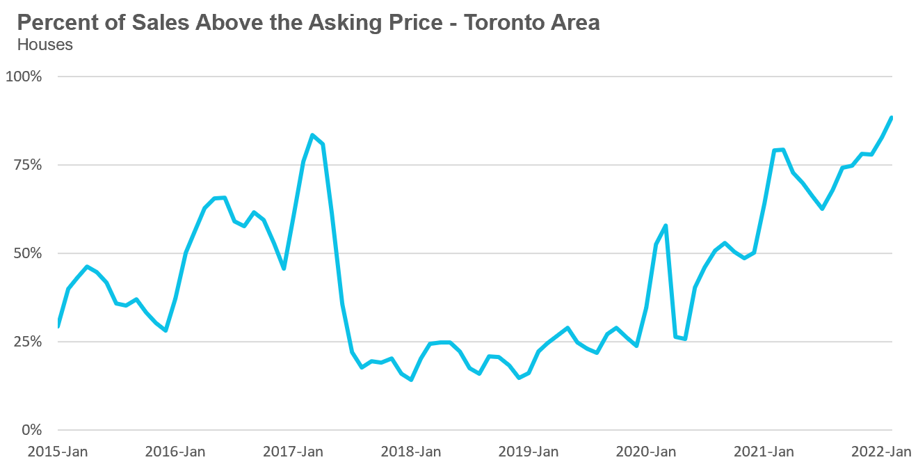
The share of houses selling for more than the owner’s asking price climbed to an unbelievable 88% in February.
The average price for a house has climbed to $1.679M in February 2022, a 31% increase over last year.
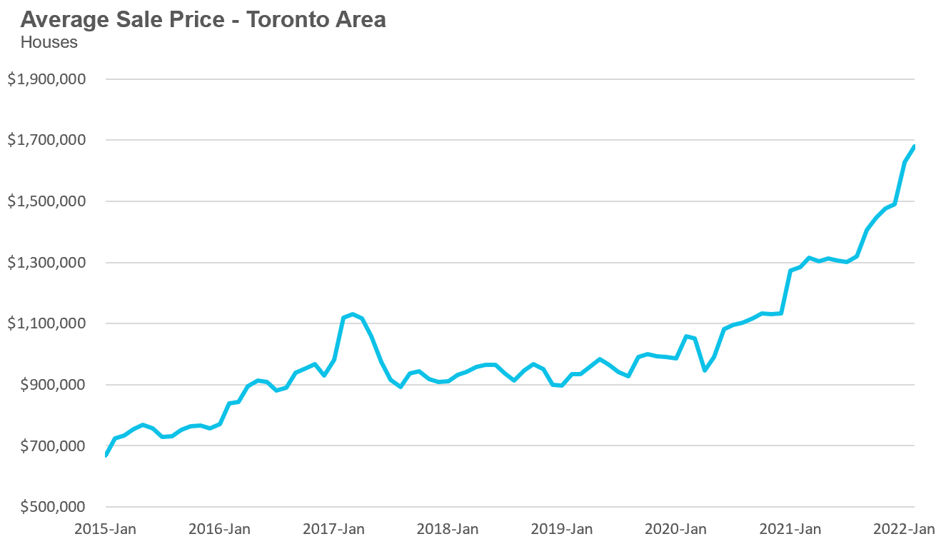
The median house price in February was $1,485,000, up 32% over last year when the median house price was $1,125,000.
The median is calculated by ordering all the sale prices in a given month and then selecting the price that is in the midpoint of that list such that half of all home sales were above that price and half are below that price. Economists often prefer the median price over the average because it is less sensitive to big increases in the sale of high-end or low-end homes in a given month which can skew the average price.
Condo (condominiums, including condo apartments, condo townhouses, etc.) sales in the Toronto area in February 2022 were down 10% over last year and up 38% compared to pre-Covid 2020.
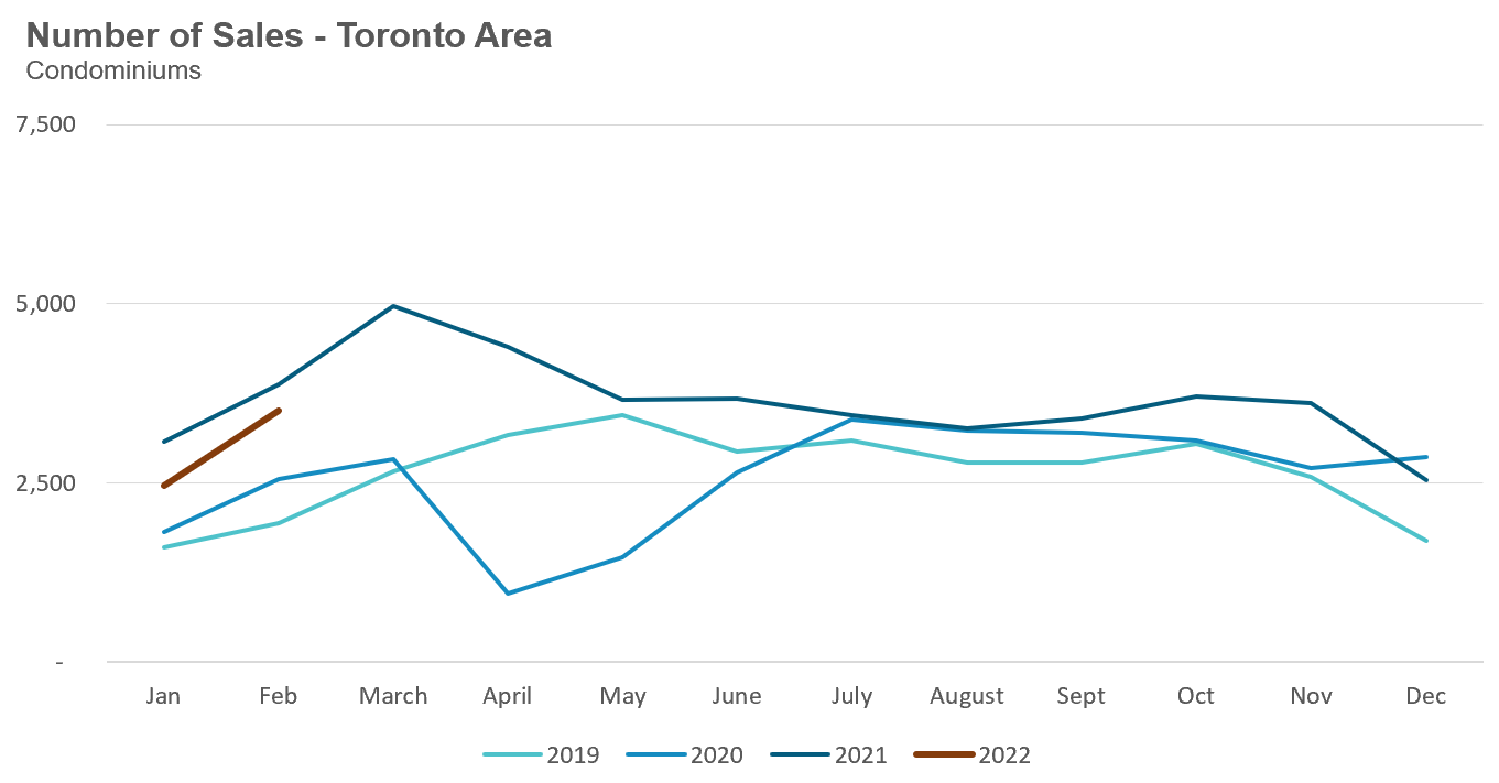
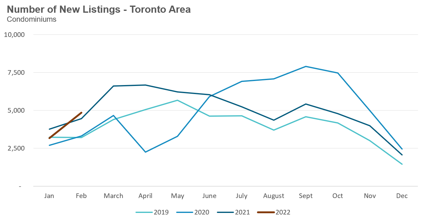
New condo listings were down by 9% in February over last year and 46% higher than pre-COVID 2020.
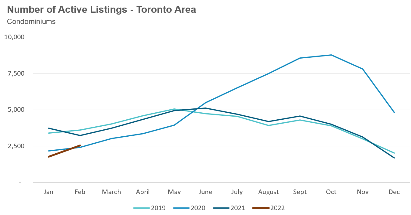
The number of condos available for sale at the end of the month, or active listings, was down 22% over last year.
The strong demand helped keep the MOI below 1 MOI for the month of February.
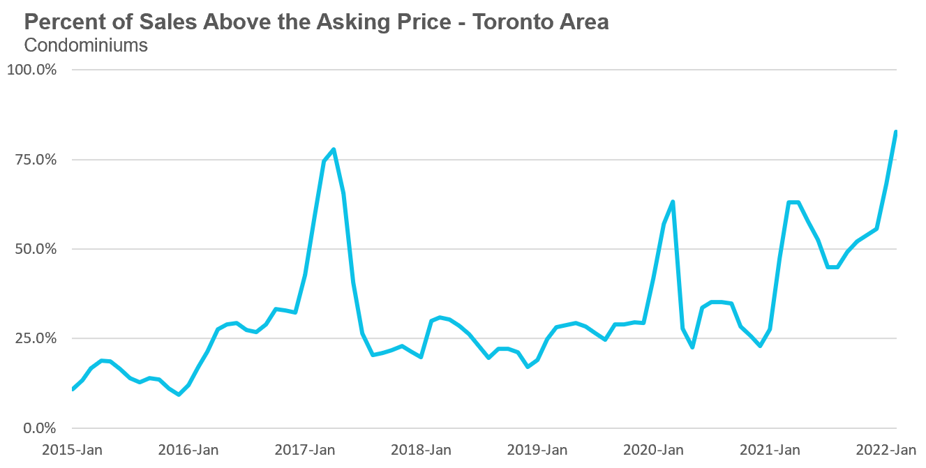
The competition for condos picked up significantly with the share of condos selling for over the asking price rising to 83% in February.
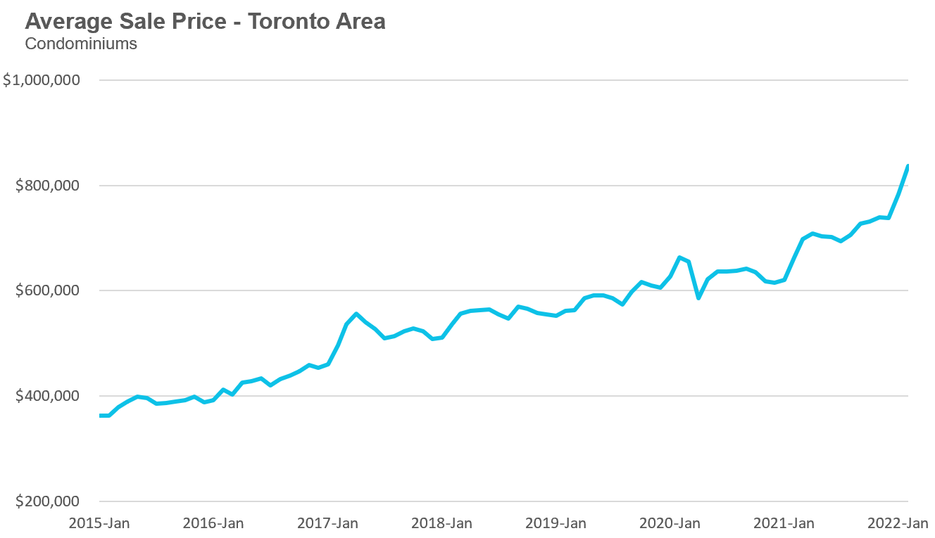
Average condo prices in February reached $836,969, up 26% over last year. The median price for a condo in February was $772,793 up 26% over last year.
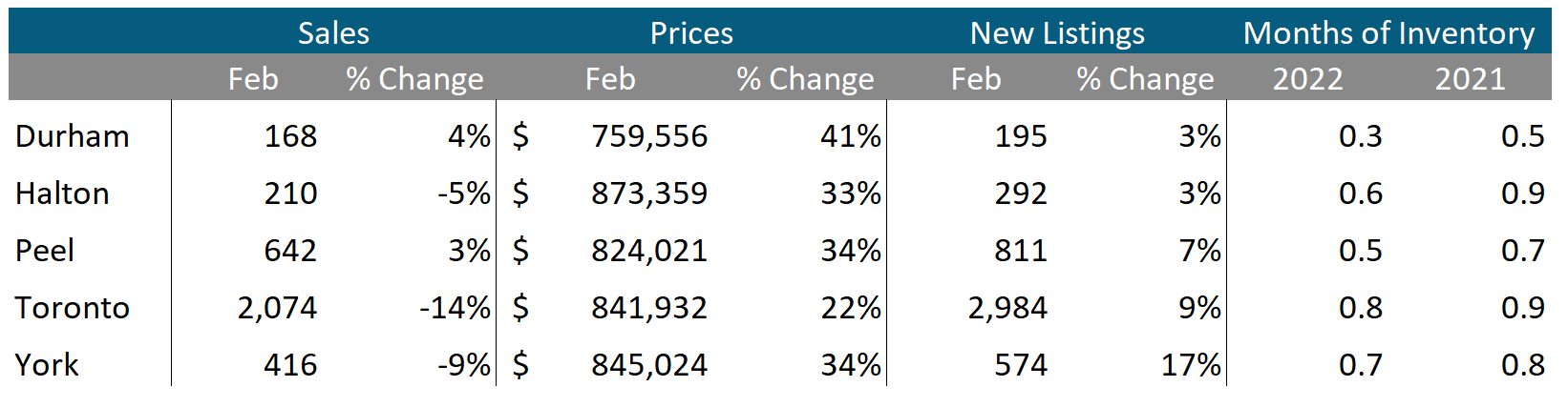
Houses
Sales across all five regions in the GTA were down in February while average prices were up on a year-over-year basis. The decline in new listings helped keep the market competitive with MOI below 1 across the entire GTA, indicating a strong seller’s market.
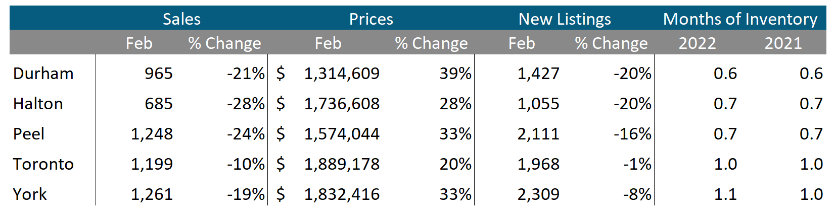
Condos
Condo sales were up in Durham and Peel, but down across the rest of the GTA in February. Average prices were up double digits in all five regions. Current MOI levels are below 1 across the GTA signalling a strong seller’s market.